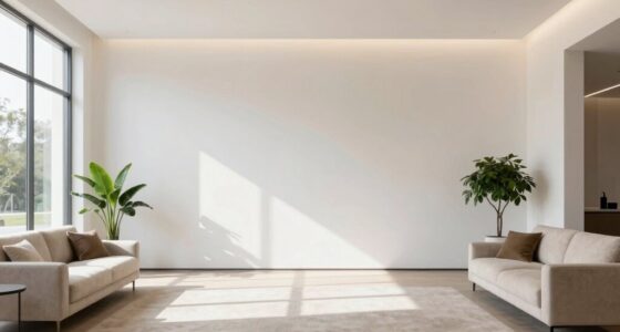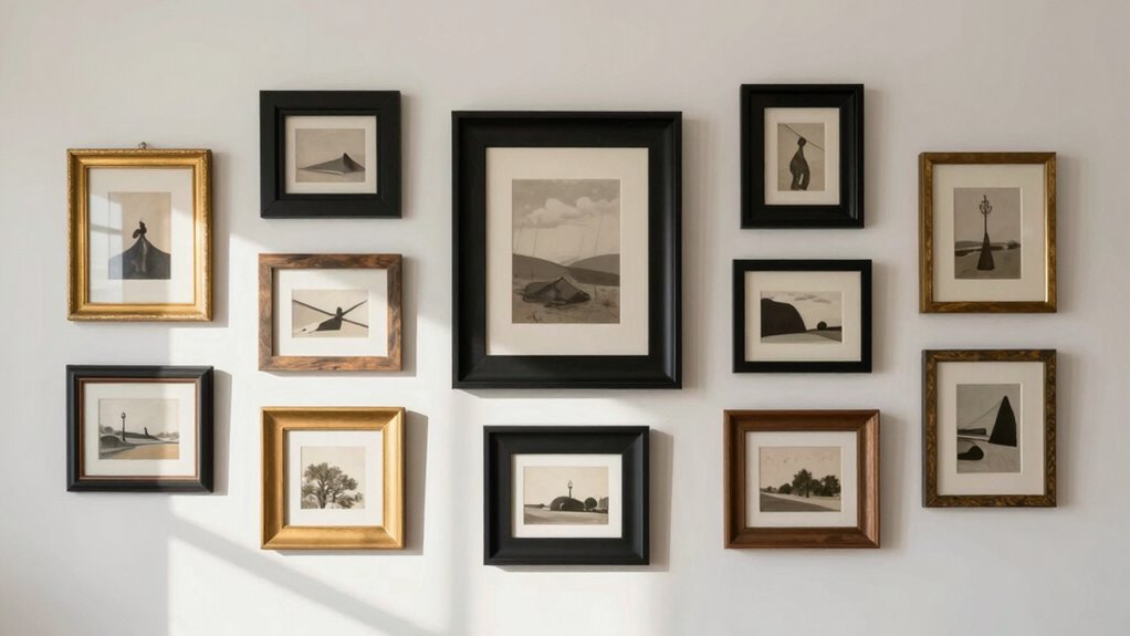

Centered gallery walls can feel random when your art pieces lack cohesion in style, color, or scale. Even if everything is aligned, inconsistent spacing or mismatched frames can disrupt the harmony you want to create. Proper layout planning and proportional spacing help your collection feel intentional and unified. By choosing artworks that complement each other and paying attention to overall balance, you can transform your gallery wall into a mesmerizing display. Keep exploring to discover how to make it truly cohesive.

Get furniture and decor delivered free with Prime
- Fast, free delivery on millions of items
- Prime Video, Amazon Music and more included
- Member-only deals all year
Key Takeaways
- Lack of cohesive art selection leads to visual dissonance despite centered placement.
- Inconsistent spacing and uneven arrangement disrupt perceived harmony.
- Mismatched frames and varying sizes create a chaotic look, undermining the centered layout.
- Absence of a clear theme or color palette makes the display appear random.
- Poor planning or trial-and-error placement can result in a disorganized overall appearance.
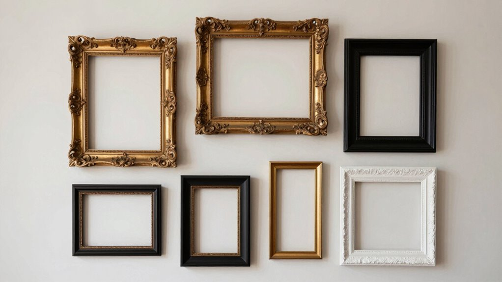
Gallery walls can often feel chaotic or unbalanced, even when they’re carefully centered on a wall. The reason often boils down to your art selection and layout planning. When you choose pieces that don’t complement each other in style, color, or scale, the overall display can seem disorganized, regardless of how perfectly it’s centered. It’s tempting to fill a space with art just to avoid empty walls, but rushing this process can lead to a mismatched collection that feels more cluttered than curated. Instead, take your time selecting pieces that share a common thread—whether that’s color palette, theme, or frame style. This consistency provides a visual anchor, making your gallery wall feel intentional rather than accidental.
Layout planning is equally critical. Even if you’ve picked the perfect art, how you arrange it can make or break the look. Visualize your wall as a whole, and consider the spacing between each piece. Too much variation in spacing creates a sense of randomness, while consistent gaps foster unity. Use paper templates or painter’s tape to experiment with different arrangements before committing to nails or hooks. This step allows you to see how the pieces interact and helps you maintain balance. Remember, the eye naturally seeks symmetry and harmony, so avoid placing too many large or small pieces directly next to each other. Instead, aim for a balanced distribution of sizes and shapes. Paying attention to visual harmony can elevate your display from chaotic to cohesive. Additionally, understanding the importance of proportional spacing can help ensure your gallery feels thoughtfully curated. When you consider visual weight, you can better distribute the visual impact across your wall, creating a more harmonious overall look. Incorporating consistent framing enhances the cohesiveness even further, tying disparate pieces together visually. Moreover, maintaining a clear focal point can help anchor your design and guide viewers’ eyes naturally across the display.
Another common pitfall is not considering the frames and matting. Even with well-chosen art, mismatched frames or inconsistent mat widths can distract viewers and make the collection seem haphazard. Choosing frames that complement the art and each other creates cohesion, anchoring the entire display. Keep in mind that the spacing between artworks should align with their scale—smaller pieces need less space, larger ones more. This proportionality ensures your gallery wall feels curated rather than randomly assembled.
Ultimately, the key to avoiding that chaotic or unbalanced feeling is to approach your gallery wall with intention. Thoughtful art selection combined with meticulous layout planning transforms a collection of individual pieces into a harmonious display. When you align your choices and arrangements with a clear vision, your gallery wall won’t just be centered—it’ll be mesmerizing and cohesive, inviting viewers to appreciate the narrative you’ve woven through your art.
As an affiliate, we earn on qualifying purchases.
Frequently Asked Questions
How Do I Choose the Best Frame Styles for My Gallery Wall?
To choose the best frame styles for your gallery wall, start by considering frame color that complements your artwork and room decor. Mix different matting styles to add visual interest and depth, but keep a cohesive theme to avoid a chaotic look. Opt for a balance of similar and contrasting frames, ensuring they work together harmoniously. This approach creates a curated, intentional display that feels stylish and unified.
What Are the Most Common Mistakes to Avoid When Designing a Gallery Wall?
You might think a gallery wall looks best when everything is perfectly aligned, but the truth is, avoiding mistakes like poor color coordination and inconsistent themes makes a big difference. Don’t forget to plan your layout before hanging; this prevents a random feel. Stick to a cohesive style, and guarantee your frames complement each other in color and theme. These small steps help your gallery wall feel intentional and visually appealing.
How Can I Incorporate Different Art Sizes Without Cluttering?
To incorporate different art sizes without cluttering, mix mediums like photos, prints, and small sculptures for visual interest. Use asymmetrical layouts, placing larger pieces as anchors and balancing smaller ones around them. Keep spacing consistent, and leave some negative space to prevent overcrowding. This approach creates a dynamic, curated look that feels intentional and stylish, even with varied sizes and mediums.
What Is the Ideal Spacing Between Frames in a Gallery Wall?
Think of your gallery wall like a well-choreographed dance—spacing and alignment matter. Aim for 2-3 inches between frames to keep spacing consistent and maintain frame alignment. This creates a cohesive look that feels intentional, not random. Use a level or spacer tools to guarantee even gaps. Consistent spacing helps your art feel balanced and harmonious, preventing your gallery wall from looking cluttered or chaotic.
How Do I Update or Refresh My Existing Gallery Wall?
To refresh your gallery wall, start by evaluating the current layout and removing any pieces that don’t fit your theme or color coordination. Introduce new artwork that complements existing frames, maintaining theme consistency. Rearrange the frames to create a more balanced composition, and consider updating matting or frames for a fresh look. This approach keeps your gallery wall cohesive and visually appealing, making it feel intentional rather than random.
As an affiliate, we earn on qualifying purchases.
Conclusion
So, next time your gallery wall feels a bit chaotic despite being centered, remember—it’s not just about perfect placement but about creating a story. Just like a good novel, a gallery wall should invite viewers in, guiding their eyes through a visual journey. Embrace the imperfections, and let your unique personality shine. After all, sometimes the most beautiful art is the one that feels just a little bit unpredictable—like life itself.
cohesive wall art and frame kits
As an affiliate, we earn on qualifying purchases.
As an affiliate, we earn on qualifying purchases.
adjustable spacing painter's tape for wall art
As an affiliate, we earn on qualifying purchases.
As an affiliate, we earn on qualifying purchases.
Halloween Picks
halloween
As an affiliate, we earn on qualifying purchases.