To plan a whole-house wall palette easily, start by choosing a core color that reflects your style and mood. Use a color wheel to pick harmonious shades and stick with consistent undertones for a natural flow. Test small samples in different rooms to see how they look with lighting and decor. Keep the palette simple with neutral tones in relaxing areas and bolder shades for energy. If you keep exploring, you’ll discover how to create a cohesive and personalized space effortlessly.
Key Takeaways
- Start with a core color palette that reflects your personal style and mood preferences.
- Use a color wheel to select harmonious shades and ensure consistent undertones across rooms.
- Test small paint samples in different lighting to see true color and undertones before committing.
- Plan zone-specific colors: neutrals for relaxing spaces and bolder shades for energetic areas.
- Maintain simplicity by limiting color choices and trusting the sampling process for a cohesive look.

Creating a cohesive wall color palette for your entire house might seem intimidating, but with a simple approach, it becomes much easier. The key is understanding color harmony—how different shades work together to create a balanced, pleasing look. Instead of feeling overwhelmed by dozens of paint swatches, focus on a core set of colors that complement each other and fit your style. Start by choosing a primary color that resonates with your personality or mood you want each space to evoke. Once you have that, select secondary shades that support or contrast gently, creating a seamless flow from one room to the next.
Paint sampling is your best friend in this process. Instead of guessing or relying solely on digital swatches, test out small samples on your walls. This allows you to see how different colors look in your home’s lighting, both natural and artificial, over a few days. It’s easy to get caught up in small color chips that seem perfect in the store but look different under your home’s lighting conditions. By sampling, you get a real sense of how a hue interacts with your furniture, flooring, and existing decor. It also helps you gauge the intensity and undertones of each color, ensuring they won’t clash or fade into the background. Understanding color harmony can significantly impact how well your palette works together.
Testing small paint samples at home reveals true color, undertones, and how lighting affects your chosen hues.
When planning your palette, think about creating zones within your home. For example, softer, neutral tones work well in bedrooms and living areas where relaxation is key, while bolder shades can energize a kitchen or home office. Keep in mind that lighter colors tend to make spaces feel larger and more open, whereas darker hues add coziness and depth. To maintain color harmony, choose a consistent undertone—whether warm or cool—so your walls naturally complement each other across rooms. This doesn’t mean every room has to be identical, but the progression from one space to another should feel intentional and smooth. A color wheel can be a helpful tool in visualizing how different hues relate and harmonize with each other.
Finally, trust your instincts as you narrow down your choices. Paint sampling helps prevent costly mistakes and gives you confidence in your selections. As you experiment, you’ll develop a clearer vision of your overall palette, making it easier to make decisions and stay consistent. With a focused approach on color harmony and thorough sampling, planning your whole-house wall palette becomes a manageable, even enjoyable, task. You’ll create a cohesive environment that reflects your personality and feels harmonious from room to room.

Pro Grade Paint Roller Kit, Brush & Roller,10 Piece Set, Wall Painting Naps for Professionals & Homeowners – All Paints & Stains, Washable, Reusable, Easy to Clean, Superior Absorbency.
WHAT'S IN THIS 10 PIECE PAINT KIT FOR WALLS: includes one plastic paint tray; one 9 inch roller…
As an affiliate, we earn on qualifying purchases.
As an affiliate, we earn on qualifying purchases.
Frequently Asked Questions
How Many Colors Should I Include in My Whole-House Palette?
You should include around 4 to 6 colors in your whole-house palette to maintain color harmony and mood consistency. Too many hues can create chaos, while too few might feel dull. Focus on selecting a main color, a couple of accent shades, and neutral tones. This balance helps set the right mood in each space, ensuring your home feels cohesive and inviting without overwhelming the senses.
What Are Common Mistakes to Avoid When Selecting Wall Colors?
When selecting wall colors, avoid ignoring color psychology, which can influence mood and space perception. Steer clear of choosing too many similar shades that clash or create confusion, and don’t forget to take into account paint finish choices—matte, satin, or gloss—based on room function. Also, skip sampling colors in different lighting conditions to make certain your choices look great throughout the day. These mistakes can lead to a less cohesive, less inviting home.
How Can I Incorporate Patterns or Textures Into My Palette?
Imagine transforming your space into a tactile wonderland! To do that, you need texture blending and pattern integration. Start by mixing textured materials like velvet, linen, or wood with smooth walls. Incorporate patterns through wallpaper, rugs, or art, ensuring they complement your color palette. Balance bold patterns with subtle textures so everything harmonizes. This approach creates visual interest and depth, making your home feel layered and inviting.
What Tools or Apps Can Help Visualize My Color Choices?
You can use tools like Sherwin-Williams ColorSnap Visualizer or Benjamin Moore’s Personal Color Viewer for digital visualization, which help you see how your color choices match and coordinate across your space. These apps allow you to upload photos and experiment with different shades, improving color matching confidence. They make it easy to visualize your palette before committing, ensuring your chosen colors work well together throughout your house.
How Do I Ensure Color Consistency Across Different Lighting Conditions?
Like a seasoned artist, you should test your paint colors in various lighting contrast scenarios, including natural and artificial light. Observe how the paint finish impacts the hue, as matte, satin, or gloss finishes can alter the appearance. By checking samples in different rooms and times of day, you guarantee consistency, preventing surprises when your walls meet the real-world lighting conditions, making your palette truly cohesive.
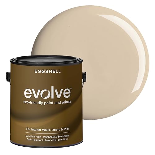
EVOLVE Interior Paint & Primer, Eggshell (Natural Beige), 1 Gallon – One-Coat Coverage, Excellent Hide, Low VOC, Low Odor, Washable Paint for Walls, Doors & Trim
PAINT + PRIMER IN ONE: Evolve’s paint-and-primer formula helps you get great coverage from the start, sealing your…
As an affiliate, we earn on qualifying purchases.
As an affiliate, we earn on qualifying purchases.
Conclusion
Ready to transform your entire home into a stunning masterpiece? With this simple planning method, you’ll be able to create a wall palette so perfect, even Picasso would be jealous! No more endless agonizing over colors or second-guessing your choices—just pure, effortless harmony that will make every room feel like a work of art. Get started today and watch your home become a breathtaking masterpiece that leaves everyone in awe—and maybe even speechless!

JimKing Creative Color Wheel, Paint Mixing Learning Guide, Art Class Teaching Tool for Makeup Painting Tattoo,Blending Board Chart Color Mixed Guide Hardboard(9.25inch)
Helps organise colours to make choices and combinations easier;Defines common terms and helps the artist to understand colour…
As an affiliate, we earn on qualifying purchases.
As an affiliate, we earn on qualifying purchases.

Bates- Paint Tray Set, Paint Roller Kit, 11 pcs, 9" & 4" Rollers, Small Roller, Trays & Covers for House Painting Supplies
Bates paint tray set includes 11 high-quality pieces, offering everything you need for a smooth and professional painting…
As an affiliate, we earn on qualifying purchases.
As an affiliate, we earn on qualifying purchases.