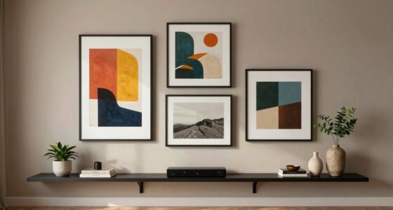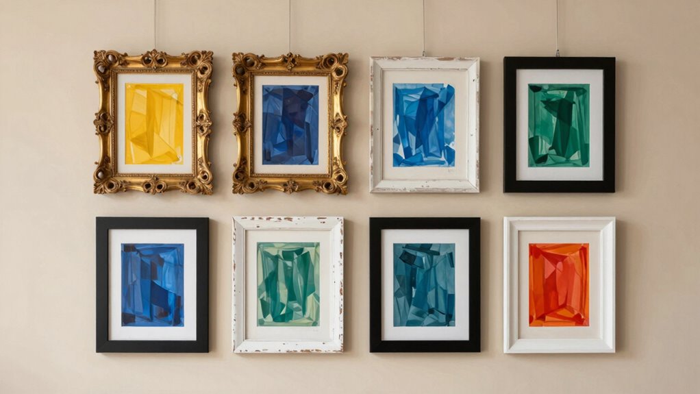

To make mixed frames work, focus on a unifying detail like a consistent color palette, style, or motif. This helps anchor the diverse pieces and creates a cohesive story for your display. Balance the arrangement by distributing visual weight evenly and consider repetition to reinforce themes. Thoughtful placement and common elements turn a jumble into an engaging, curated collection. Keep exploring – you’ll discover more tips to elevate your display even further.

Get furniture and decor delivered free — and shop member deals
- Fast, free delivery on millions of items
- Access to Prime Big Deal Days deals on October 6–7
- Prime Video, Amazon Music and more included
Key Takeaways
- Consistent color schemes create visual harmony across diverse frames.
- Repeating motifs or themes unify different styles and shapes.
- Balanced arrangement evenly distributes visual weight, enhancing cohesion.
- Establishing a clear visual hierarchy guides the viewer seamlessly through the display.
- Thoughtful placement and spacing foster a cohesive, engaging composition.
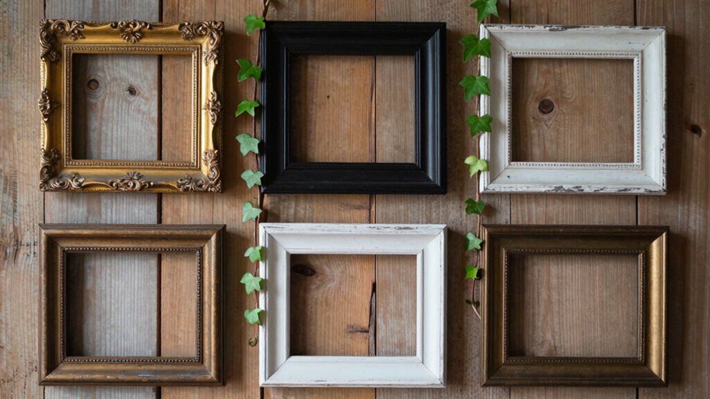
Mixed frames can seem chaotic at first glance, but their success hinges on one key element: a unifying detail that ties everything together. This unifying detail often comes down to how you approach color coordination and maintaining visual balance. When you’re assembling a gallery wall or a display of various frame styles and sizes, the eye can easily become overwhelmed or distracted by the differing elements. That’s where intentionality in color and arrangement makes all the difference. By choosing a cohesive color palette or repeating a particular hue throughout your collection, you create a visual thread that guides the viewer’s eye smoothly across the display. This consistency helps anchor the diverse frames, making the arrangement feel intentional rather than haphazard.
A cohesive color palette anchors diverse frames, guiding the eye and creating an intentional, harmonious display.
Visual balance plays an equally crucial role. When you’re mixing frames of different shapes, sizes, and styles, it’s easy for one area to seem cluttered or overly heavy. To prevent this, you want to distribute weight evenly across the display. Think of it like balancing a scale—you don’t want all the large frames clustered in one corner. Instead, you spread out larger pieces with smaller ones, creating a rhythm that your eye can follow naturally. This balance ensures no single element overwhelms the rest, and the overall composition appears harmonious. It’s about paying attention to how each piece interacts with its neighbors and adjusting placement accordingly. Additionally, understanding the importance of a visual hierarchy can help you prioritize focal points within your arrangement. Incorporating repetition of motifs can also enhance cohesion and guide the viewer’s eye through the display. Recognizing the significance of visual rhythm can further create a seamless flow from one piece to the next.
You don’t need every frame to match perfectly, but establishing a common element—like a specific color, material, or style—serves as the visual anchor. For example, if all frames share a similar tone or finish, the variety of styles becomes a feature rather than a distraction. Similarly, incorporating a recurring color or motif within your artwork or photos enhances cohesion. When you keep color coordination in mind and craft a sense of visual balance, the mixed frames become an engaging, curated display rather than a cluttered jumble.
In essence, your success depends on the details you choose to emphasize. The unifying detail—whether it’s a color theme, a style motif, or an arrangement principle—guides the eye and creates a cohesive story. By intentionally focusing on color coordination and visual balance, you turn a seemingly chaotic mix of frames into a sophisticated, balanced composition that feels both dynamic and harmonious. It’s these thoughtful touches that elevate your display from random to curated, making every piece work together beautifully.
As an affiliate, we earn on qualifying purchases.
Frequently Asked Questions
How Do I Choose the Right Unifying Detail for My Frames?
To choose the right unifying detail for your frames, focus on creating visual harmony through frame grouping. Look for common elements like color, material, or style that tie the pieces together. Consider the overall theme or mood you want to convey, and select details that reinforce this. By maintaining consistency in key features, you help your mixed frames work seamlessly, making your display feel intentional and balanced.
Can Mixed Frames Work in Small or Cluttered Spaces?
In a small, cluttered living room, mixed frames can work beautifully by balancing asymmetry and incorporating texture. For example, arrange varied-sized frames asymmetrically on a wall, mixing sleek black-and-white photos with textured, colorful artwork. This approach draws the eye and creates visual interest, preventing the space from feeling chaotic. Emphasizing balance and texture helps the frames coexist harmoniously, even in limited or busy spaces.
What Materials Are Best for Creating a Unifying Detail?
You should choose materials that create interesting contrasts and complement each other through frame textures. For instance, pairing sleek metal frames with rustic wood ones highlights material contrasts, while consistent color tones unify diverse textures. Using natural materials like wood, fabric, or leather can add warmth, and mixing matte and glossy finishes enhances visual interest. These choices help establish a unifying detail that ties your mixed frames together seamlessly.
How Do Color Schemes Influence the Effectiveness of Mixed Frames?
Color schemes considerably influence the effectiveness of mixed frames by enhancing visual consistency through color harmony. When you choose a cohesive palette, it unites diverse frames, making the display look intentional and harmonious. Avoid clashing colors; instead, opt for complementary or analogous schemes that create a balanced look. This approach guides the viewer’s eye smoothly across your collection, highlighting your unifying detail and ensuring a polished, cohesive display.
Are There Design Styles That Suit Mixed Frames Better Than Others?
You’ll find that minimalist and modern design styles suit mixed frames best because they emphasize gallery consistency and frame harmony. These styles allow varied frames to complement each other without overwhelming the space, creating a cohesive look. By focusing on clean lines and simple color palettes, you guarantee the frames work together seamlessly, highlighting your artwork while maintaining a balanced, unified aesthetic.
As an affiliate, we earn on qualifying purchases.
Conclusion
Think of mixed frames like a symphony, each instrument playing its part. When you find that unifying detail—like a conductor guiding the orchestra—you create harmony amid diversity. Without it, the pieces clash and chaos ensues. But with that one cohesive element, your frames come together seamlessly, telling a compelling story. Embrace this unifying detail, and watch your visuals transform into a beautiful, unified melody that captures your audience’s heart.
As an affiliate, we earn on qualifying purchases.
As an affiliate, we earn on qualifying purchases.
Fall Picks
fall essentials
As an affiliate, we earn on qualifying purchases.