
TL;DR
Interior designer Yoko Kloeden describes five Japanese wall-color references that can bring warmth to minimalist rooms: susutake-iro, shiracha, rikyū-nezu, kyō-sabi and tsuchikabe. The palette favors earthy undertones over blue- or black-cooled neutrals; the color descriptions are design guidance, not a guarantee of how paint will look in every home.
Interior designer Yoko Kloeden has outlined five Japanese wall-color references for homeowners seeking a warmer feel in minimalist rooms, ranging from tea-toned off-white to muted green-gray and clay brown. The recommendations, published by Livingetc, focus on earthy undertones that Kloeden says avoid the cool cast she associates with some Western off-whites and greiges.

Get furniture and decor delivered free with Prime
- Fast, free delivery on millions of items
- Prime Video, Amazon Music and more included
- Member-only deals all year
Kloeden’s five examples are susutake-iro, a smoke-darkened bamboo brown-black; shiracha, a warm off-white resembling white tea; rikyū-nezu, a gray with green undertones; kyō-sabi, a muted red-brown clay color; and tsuchikabe, a settled mid-brown inspired by traditional clay walls. The descriptions connect each color to materials, landscapes or objects rather than to a single standardized paint formula.
For comparable ready-made shades, the article names paint products including Little Greene Attic II for susutake-iro, Farrow & Ball Stirabout for shiracha, and Little Greene Ambleside for rikyū-nezu. It also suggests Farrow & Ball Dead Salmon as a modern approximation of kyō-sabi, and Farrow & Ball Duster for tsuchikabe. These are presented as similar options, not exact matches.
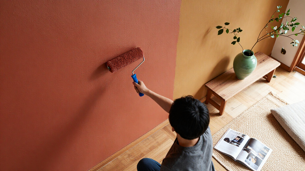
Kloeden also recommends matte paint, limewash or clay plaster for a surface whose appearance shifts with texture and light. The article does not provide product testing, paint formulas or measured color values, so readers should treat the named shades as starting points and check samples in the room where they plan to use them.
Five Japanese wall colors for a warmer home
Interior designer Yoko Kloeden recommends earthy color references to warm minimalist rooms. Their appearance depends on light, texture and surrounding finishes.
The five color references
Each name draws on a material, landscape or object.
Susutake-iro
Smoke-darkened bamboo brown-black, with red and amber beneath.
Shiracha
Warm off-white like white tea; its brown character comes forward under lamplight.
Rikyū-nezu
A subdued gray with green undertones, compared with dried sage or lichen.
Kyō-sabi
Muted red-brown clay; natural clay shades can vary.
Tsuchikabe
A settled mid-brown inspired by clay mixed with chopped straw and sand.
Approximate paint options
The article presents these commercial shades as starting points, not exact matches.
| Color reference | Suggested paint |
|---|---|
| Susutake-iro | Little Greene Attic II |
| Shiracha | Farrow & Ball Stirabout |
| Rikyū-nezu | Little Greene Ambleside |
| Kyō-sabi | Farrow & Ball Dead Salmon |
| Tsuchikabe | Farrow & Ball Duster |
Choose by undertone and finish
Kloeden’s approach favors earthy undertones over neutrals cooled with blue or black.
- Look for yellow, red or green undertones.
- Consider matte paint, limewash or clay plaster.
- Compare sample patches in the intended space.
- View them in daylight and under evening lighting.
- Notice how texture and nearby finishes affect the color.
How Earthy Neutrals Warm a Room
The suggestions offer an alternative to choosing a neutral by brightness alone. A white or gray can appear different as daylight changes, and Kloeden’s approach is to look for yellow, red or green undertones rather than blue or black. That distinction may help readers who want a pared-back palette but find cooler neutrals stark in their home.
The five references also show how a color can relate to the character of a material: smoke-darkened bamboo, tea, sage, local clay or straw-mixed plaster. In practice, lighting, surface texture and surrounding finishes all affect how a paint color reads. The advice is useful as a design framework, but it cannot predict the precise result in each room.
Products Worth Considering

Levoit Core 400S-P Smart Air Purifier for Large Rooms

VIZIO 65-Inch V-Series 4K HDR Smart TV

Levoit Vital 100S-P Air Purifier for Home and Pets
As an affiliate, we earn on qualifying purchases.
Five Colors and Their Origins
The article frames the palette through Japanese materials and traditional color descriptions. Kloeden characterizes susutake-iro as bamboo darkened by smoke in an old thatched farmhouse, retaining red and amber beneath its dark surface. She describes shiracha as a brown diluted with enough white to appear off-white in daylight, with more of its brown character showing under lamplight.
Rikyū-nezu is linked to tea master Sen no Rikyū and subdued colors, and compared with dried sage or lichen. Kloeden describes kyō-sabi as muted red-brown clay dug in Fukakusa, in southern Kyoto, and notes that natural clay varies. Tsuchikabe refers to clay mixed with chopped straw and sand; the article identifies juraku clay as a well-known Kyoto variety and says the ground where it was found has become scarce as the city has expanded.
The examples are not a claim that all Japanese interiors use these colors. They are a designer’s selection of references for bringing warmth to minimalist schemes, with contemporary paint colors offered as approximations.
“The Japanese wall colors that warm a minimalist room are all earth colors, and none of them have blue in them.”
— Yoko Kloeden, interior designer
Paint Matches Depend on the Room
The article does not give exact paint codes, undertone measurements or a method for matching the historic and material-based color names to commercial paints. Its product suggestions are visual approximations, and the final appearance may vary with daylight, artificial lighting, wall texture and nearby colors.
It is also unclear when the Livingetc article was published, as no publication date is included in the supplied details. The palette is presented as Kloeden’s design advice rather than as a formal survey of Japanese homes or a set of universally accepted standards.
Test Samples Before Painting
For homeowners considering the palette, the practical next step is to compare sample patches in the intended room and view them at different times of day, including under the lighting used at night. Testing the finish as well as the color can help show whether matte paint, limewash or clay plaster suits the wall and the desired effect.
The five shades can guide a warmer neutral scheme, but no further product testing or follow-up findings are included in the article. The eventual choice depends on the room’s light, materials and the homeowner’s preference.
Source: rss
Key Questions
What are the five Japanese-inspired wall colors?
The colors are susutake-iro, shiracha, rikyū-nezu, kyō-sabi and tsuchikabe. They are described respectively as smoky brown-black, tea-toned off-white, green-gray, muted red-brown and clay-like mid-brown.
Which paint colors does the article suggest?
The article lists Little Greene Attic II, Farrow & Ball Stirabout, Little Greene Ambleside, Farrow & Ball Dead Salmon and Farrow & Ball Duster as approximate options for the five references. The matches are not described as exact equivalents.
What makes these colors feel warmer, according to Yoko Kloeden?
Kloeden says these shades rely on earthy yellow, red or green undertones, rather than blue- or black-cooled neutrals. This is her design guidance, and the effect can vary by room.
Can lighting change how these wall colors look?
Yes. Kloeden says shiracha may read as cream in daylight and show more brown under lamplight. The article also notes that textured finishes can make color vary across a wall.
What finishes does Kloeden recommend?
She suggests a matte finish, limewash or clay plaster. The article says texture can affect how color appears, but it does not compare the durability or maintenance needs of these finishes.
Source: livingetc.com