Using negative space effectively in gallery walls creates balance and visual harmony. It’s about giving your artwork room to breathe, preventing clutter, and guiding the viewer’s eye smoothly across the display. Thoughtful spacing and color choices help emphasize focal points and make each piece stand out. Mastering negative space turns a simple collection into a cohesive, inviting feature. Keep exploring to discover tips that will elevate your gallery wall’s design and impact.
Key Takeaways
- Negative space creates balance and cohesion, preventing clutter and guiding the viewer’s eye across the gallery wall.
- Proper spacing between frames ensures harmony; avoid overcrowding or excessive gaps for a polished look.
- Using subdued negative space around bold artwork helps it stand out without visual chaos.
- Negative space functions as a design element, emphasizing focal points and creating visual pathways.
- Strategic use of negative space enhances overall aesthetic, making the gallery wall inviting and well-curated.
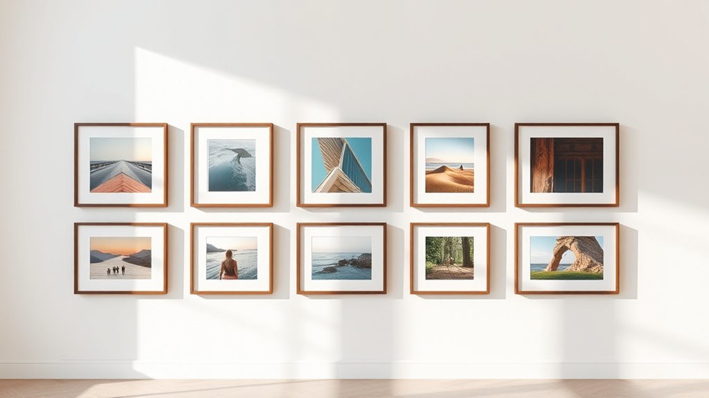
Negative space plays an essential role in creating balanced and visually appealing gallery walls. When you’re arranging your frames, it’s not just about the artwork itself but also about how the empty spaces around them influence the overall look. Properly managing negative space allows your wall to breathe, preventing it from feeling cluttered or overwhelming. Instead, it guides the viewer’s eye smoothly across the display, making each piece stand out while contributing to a cohesive composition.
One of the key elements to contemplate is frame arrangement. As you place your frames, think about the spacing between each piece. Too close, and the wall can feel crowded; too far apart, and the collection may seem disjointed. Striking a balance involves leaving enough negative space around each frame so that every piece has room to breathe, yet remains connected to the overall arrangement. Visualize an invisible grid or use painter’s tape to map out your layout before hanging. This way, you can experiment with different arrangements without committing prematurely, ensuring your frames are spaced consistently and thoughtfully.
Color balancing is equally essential in managing negative space. When your artwork features bold, vibrant hues, the surrounding empty space should be more subdued to avoid visual chaos. Conversely, if your pieces are mostly neutral or monochromatic, you might consider using a more varied or colorful negative space to add interest. Negative space doesn’t have to be plain white or neutral—it can be painted in a complementary color or left as a textured wall surface to add depth. By carefully balancing colors between your frames and the negative space, you create a harmonious flow that feels intentional and polished. Additionally, understanding cookie categories helps in appreciating how visual elements like negative space contribute to overall harmony and user experience.
As you finalize your gallery wall, keep in mind that negative space isn’t just empty; it’s an active design element. Use it to emphasize your focal points or to create visual pathways that lead the eye naturally from one piece to another. The right amount of negative space can highlight your favorite artwork, make your frames stand out, and overall improve the aesthetic harmony. Remember, the goal isn’t to fill every inch but to curate a space that feels balanced, inviting, and thoughtfully composed. When you master the art of negative space, your gallery wall transforms from a simple display into a captivating visual story.
Frequently Asked Questions
How Does Negative Space Influence Visual Balance in Gallery Walls?
Negative space plays a vital role in creating visual harmony in your gallery wall. It helps balance the arrangement, preventing clutter and guiding the viewer’s eye smoothly across the display. By thoughtfully incorporating negative space, you enhance the compositional flow, making each piece stand out while maintaining overall cohesion. This balance keeps your gallery wall engaging and aesthetically pleasing, ensuring a harmonious display that feels intentional and well-structured.
What Are Common Mistakes When Incorporating Negative Space?
You often make mistakes by neglecting artistic consistency and poor framing choices when incorporating negative space. Guarantee your negative space complements your artwork, avoiding clutter or uneven gaps that disrupt visual harmony. Be mindful of the size and shape of frames, as inconsistent framing can draw attention away from the overall balance. By maintaining a cohesive style and thoughtful framing, you enhance your gallery wall’s aesthetic and preserve the intentional use of negative space.
Can Negative Space Make Smaller Gallery Walls Appear Larger?
Yes, negative space can make smaller gallery walls appear larger. By intentionally increasing spacing illusions between your frames, you create a sense of openness and depth. Use framing strategies like uniform matting or consistent gap sizes to enhance this effect. This approach draws the eye outward, making the wall feel more expansive and less cluttered, giving your space a more balanced and airy look.
How Do Different Wall Colors Affect Negative Space Perception?
Different wall colors markedly influence how you perceive negative space. Light wall tones with high color contrast make negative space stand out more, giving your gallery wall a spacious feel. Conversely, darker or more muted wall colors reduce contrast, making negative space seem more integrated and cozy. By choosing wall tones thoughtfully, you can control the perception of negative space, either emphasizing or softening it to suit your style.
What Tools or Techniques Help Measure Optimal Negative Space?
To measure ideal negative space, you can use measuring tools like a ruler, tape measure, or laser distance meter for precise spacing. Spacing techniques such as creating consistent gaps between frames or using grid templates help you visualize and maintain balance. Experiment with paper cutouts or painter’s tape on the wall to preview arrangements. These tools and techniques guarantee your gallery wall feels harmonious and well-balanced, highlighting your artwork effectively.
Conclusion
Mastering the magic of negative space makes your gallery wall more than just a collection of pictures. By balancing bold and bare, you bring harmony, highlight highlights, and create a mesmerizing canvas. Don’t ignore the importance of intentional empty areas—they’re the breathing space that brings your display to life. So, take your time, trust your taste, and transform your wall into a work of art where negative space naturally nurtures your visual vibe.