Dim-to-warm lighting adjusts color temperature smoothly, shifting from cooler to warmer tones to enhance mood and create a natural, inviting atmosphere for art displays. High CRI values ensure colors appear vibrant and true to life under any lighting condition. Combining both allows you to control ambiance while maintaining accurate color representation, making your artwork look authentic and emotionally engaging. Continue exploring these concepts to discover how they can transform your art presentation.
Key Takeaways
- Dim-to-warm lighting adjusts color temperature smoothly from cool to warm, enhancing mood and ambiance in art displays.
- High CRI (Color Rendering Index) ensures accurate color reproduction, preserving artwork’s true hues under different lighting conditions.
- Combining dim-to-warm technology with high CRI creates versatile, authentic viewing environments that highlight artwork details and emotional impact.
- Proper use of warm tones (2700K–3000K) fosters inviting atmospheres, while cooler tones (above 5000K) emphasize clarity and sharpness.
- Balancing dim-to-warm features with high CRI maintains color accuracy and dynamic lighting, crucial for showcasing art authentically.
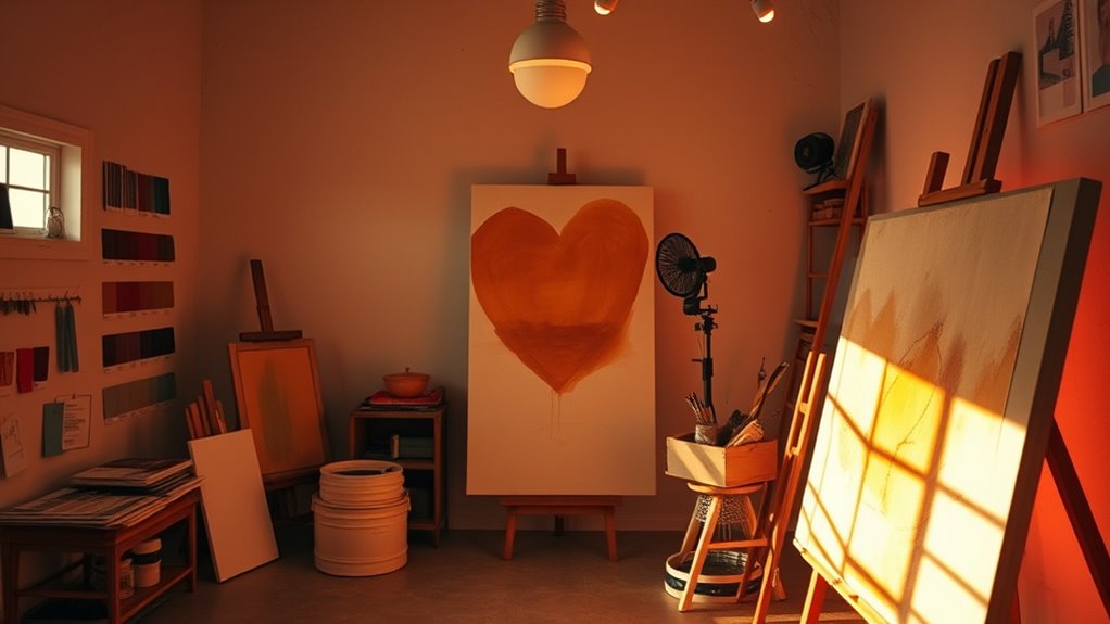
When it comes to lighting art, understanding dim-to-warm features and CRI (Color Rendering Index) is essential for accurately showcasing colors and details. One of the key aspects to grasp is color temperature, measured in Kelvins (K). Color temperature influences the mood and perception of your artwork, with warmer tones around 2700K to 3000K creating a cozy, inviting atmosphere, while cooler tones above 5000K highlight sharper details and a more neutral, clinical look. When selecting lighting, it’s vital to consider how the color temperature impacts your work’s overall appearance, ensuring it aligns with your artistic intent.
Using dim-to-warm lighting technology allows you to adjust the color temperature dynamically, seamlessly transitioning from a cooler light to a warmer glow. This feature is especially useful in gallery settings or when you want to highlight different aspects of a piece at various times. As you dim the light, the color temperature shifts naturally toward warmer tones, mimicking the natural progression of sunset or candlelight, which can add depth and emotional resonance to your viewing experience. This flexibility helps maintain color accuracy, ensuring that the hues and shades you see are true to the original artwork. Additionally, understanding the lighting environment can help optimize how your art appears under different conditions.
Color accuracy is a critical factor in how viewers perceive your art. This is where CRI (Color Rendering Index) comes into play. CRI measures how well a light source renders colors compared to natural daylight, with a maximum score of 100. A high CRI light source ensures that the colors in your artwork appear vibrant, true-to-life, and consistent across different lighting conditions. Low CRI lighting, on the other hand, can distort colors, making reds appear dull, blues look off, or details fade into the background. When choosing lighting for your art, prioritize options with a high CRI to preserve the integrity of your work’s color palette.
Incorporating dim-to-warm features with high CRI lighting creates a versatile environment that enhances your artwork’s visual impact. It allows you to control both the ambiance and the accuracy of colors, ensuring viewers see your art as intended. Whether you’re adjusting the lighting to match different times of day or creating a specific mood, understanding these concepts helps you make informed decisions that showcase your work at its best. Ultimately, balancing proper color temperature with high CRI lighting guarantees that your art’s colors remain vibrant, accurate, and compelling, offering an authentic viewing experience for every observer.

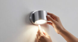
LYTARA Dimmable Cordless Picture Light with Controller and Timer, Rechargeable 5000mAh Battery Wall Sconce for Wall Pictures, Gallery Artwork, Paintings, Portraits, Dartboards (Gold)
LYTARA Dimmable Cordless Picture Light: Illuminate your wall pictures, gallery artwork, paintings, portraits, and dartboards with our elegant...
As an affiliate, we earn on qualifying purchases.
Frequently Asked Questions
How Do Dim-To-Warm Lights Affect Color Accuracy in Artwork?
Dim-to-warm lights can impact your artwork’s color accuracy by altering the color temperature and light spectrum as they dim. When you lower the brightness, the light shifts to warmer tones, which may distort how colors appear. This change can make it harder to judge true hues, especially if your lighting isn’t consistent. To maintain accuracy, choose dim-to-warm lights with a high CRI and stable spectrum across brightness levels.
What Are the Best CRI Levels for Different Art Mediums?
You’ll want high CRI levels—above 90—for most art mediums, as they guarantee accurate color rendering and true-to-life hues. For detailed watercolors or acrylics, stick to 95+ CRI, mimicking natural light’s full spectrum. Less critical for quick sketches or practice, but if you crave color fidelity, don’t settle for anything less than a light spectrum that’s rich and balanced, because your art deserves nothing less.
Can Dim-To-Warm Lighting Be Used in Outdoor Art Displays?
Yes, you can use dim-to-warm lighting in outdoor art displays, but guarantee it’s designed for outdoor durability and water resistance. These features protect the lighting from weather elements like rain and humidity, maintaining performance and longevity. Opt for fixtures specifically rated for outdoor use, and check for proper sealing and corrosion resistance. This way, you’ll enjoy adjustable warm lighting that enhances your outdoor art without compromising durability.
How Does CRI Impact Restoration and Conservation Lighting?
CRI acts like a faithful mirror, reflecting true colors during restoration. It directly impacts your lighting choice by ensuring accurate color temperature and enhancing color contrast, which helps reveal subtle details. A high CRI allows you to see the artwork’s original hues clearly, preventing misinterpretation. Low CRI lighting can distort colors, risking damage and misjudgments. So, for preservation, prioritize high CRI lights to maintain authenticity and detail.
Are There Affordable Options for High-Cri Dim-To-Warm Lighting?
Yes, you can find budget options for high-CRI dim-to-warm lighting. Look for LED fixtures with adjustable color temperature and high CRI ratings, often available at affordable prices. When installing, guarantee proper dimming compatibility and consider placement to maximize lighting quality. Some brands offer cost-effective solutions that don’t compromise on color accuracy, making them excellent choices for art display and preservation without breaking the bank.
EZVALO Picture Light for Wall, 4800mAh Rechargeable Wireless Remote Battery Lights for Painting, 16In Dimmable Magnetic LED Art Display Light, Colors Temperatures, for Gallery, Living Room,Hallway
USB Rechargeable & Easy Charge: Our picture light with with built-in 4800mAh large-capacity battery and comes with a...
As an affiliate, we earn on qualifying purchases.
Conclusion
Think of your art lighting like tuning a guitar—small adjustments in color temperature and CRI can make your work sing. I once struggled with dull-looking paintings until I switched to dim-to-warm lighting, and suddenly, everything popped with life. Just like a well-tuned instrument, understanding these basics helps your art shine in its best light. Mastering this can turn a good piece into a masterpiece, making your creative vision truly come alive.

Tassuowell Wireless Picture Lights for Wall Rechargeable, Battery Operated Art Light for Paintings, 3CCT Dimmable, 15.7" Brass Finish with Remote, Rotatable Gallery Light for Pictures Display
[Powerful Rechargeable Battery] This 15.75 inch wireless LED picture light has a built-in 5000mAh rechargeable battery and comes...
As an affiliate, we earn on qualifying purchases.

Situ Lighting: Plug-in Vision Series Remote Controlled LED Art and Picture Light - USA Made - 2700K
COMPACT AND ADJUSTABLE PLUG-IN ART LIGHTING: Experience the convenience of compact, adjustable LED art lights available in three...
As an affiliate, we earn on qualifying purchases.