
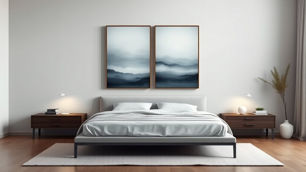
When choosing art above your bed, aim for a piece that’s about two-thirds to three-quarters of your bed’s width for balance. For a single artwork, sizes like 24×36 inches work well, while diptychs and triptychs should be proportioned accordingly, often spanning a similar width with panels evenly spaced. Consider height placement so the art hangs at eye level or just above the headboard for harmony. Keep in mind, the right scale creates a cohesive look—details you’ll discover if you keep exploring.
Key Takeaways
- Single artwork above the bed typically ranges from 24×36 inches to serve as a focal point.
- Diptychs and triptychs should collectively span about two-thirds to three-quarters of the bed’s width.
- Maintain a cohesive scale with the bed size: larger pieces for king-sized beds, smaller for twin beds.
- Vertical or horizontal orientation depends on wall space, bed height, and overall room proportions.
- Standard sizing for multiple panels includes each panel around 16×20 inches for balanced visual impact.
Understanding the Standard Sizes for Wall Art

Understanding the standard sizes for wall art is essential for creating a balanced and visually appealing display. When selecting pieces, consider color coordination to guarantee your artwork complements your bedroom’s palette, enhancing harmony and coziness. Standard sizes like 16×20 inches or 24×36 inches provide a versatile foundation, but don’t overlook the importance of material durability—choose prints on sturdy canvas or framed art that withstands humidity and daily wear. Knowing these sizes helps you avoid overcrowding or empty spaces above your bed. Keep in mind that larger pieces can serve as focal points, while smaller ones work well for grouped arrangements. By paying attention to size standards, color coordination, and material durability, you’ll craft a cohesive, stylish wall display that elevates your bedroom’s aesthetic. Additionally, understanding art framing options can further enhance the presentation and longevity of your chosen pieces. Being aware of standard art dimensions allows for better planning and arrangement, ensuring your wall art complements your space perfectly. Incorporating art placement strategies can help you achieve a balanced and harmonious look in your bedroom. Moreover, familiarizing yourself with wall art proportion guidelines can assist in achieving visual harmony in your display.
Choosing the Right Scale for Your Bedside Wall

When selecting wall art above your bed, consider the proportion of the artwork to your wall space to avoid overwhelming or underwhelming the area. Achieving visual balance and harmony helps create a soothing and cohesive look. By paying attention to these points, you’ll find the perfect scale that complements your bedside wall. Incorporating rustic decor elements can enhance the farmhouse aesthetic and ensure your artwork aligns with the overall design style.
Proportional Wall Space
Choosing the right scale for your bedside wall is essential to creating a balanced and harmonious space. Proportional wall space guarantees your artwork complements the bed without overwhelming or appearing too small. To achieve scale harmony, consider the size of your bed and the available wall area. A piece that’s too large can dominate the space, while one that’s too small may look insignificant. Aim for a visual weight that feels balanced relative to the bed and surrounding elements. Typically, artwork occupying about 60-75% of the wall space above the bed creates a pleasing proportion. Pay attention to how the artwork’s size relates to the bed’s width, ensuring it enhances the overall room flow without disrupting visual balance. Additionally, understanding aesthetic wall organization can help you select the most appealing arrangement for your artwork. Recognizing how Proportional wall space interacts with other design elements can further refine your decorating strategy. Incorporating visual hierarchy into your layout can also guide the viewer’s eye and improve overall visual harmony.
Visual Balance and Harmony
Selecting artwork that creates visual balance and harmony guarantees your bedroom feels cohesive and inviting. Focus on color coordination to guarantee the pieces complement your existing decor and bedding. Choose artwork with hues that enhance the room’s overall palette, avoiding clashes that disrupt harmony. Frame styles also play a vital role; sleek, simple frames can unify different pieces, while ornate frames add elegance but should be consistent across your selection. When arranging your artwork, consider the scale relative to your bed and wall space—larger pieces command attention without overwhelming, while smaller works add detail. Aim for a balanced composition where the artwork feels integrated, not fragmented, ensuring your bedside wall becomes a harmonious focal point. Incorporating pieces that reflect Textile Line themes, such as beach-inspired motifs, can evoke relaxation and serenity in your space. Paying attention to visual balance principles ensures that each piece contributes to a pleasing overall aesthetic. Additionally, understanding artwork scale helps in selecting pieces that enhance rather than compete with your room’s proportions.
How to Determine the Perfect Width for Above-the-Bed Art
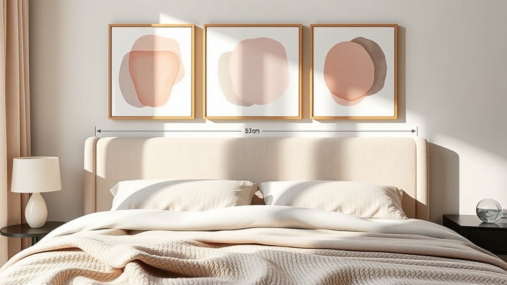
Finding the perfect width for above-the-bed art involves balancing the artwork with the size of your bed and the surrounding space. Typically, aim for art that spans about two-thirds to three-quarters of your bed’s width, creating visual harmony. Consider color coordination; choose artwork with hues that complement your bedding and room palette to enhance cohesion. Frame styles also matter—sleek, simple frames suit modern decor, while ornate frames can add elegance to traditional settings. Avoid art that’s too narrow or wide, which can disrupt the room’s balance. Instead, select a width that feels proportional, making your bed the focal point without overwhelming the space. Remember, the right width ties everything together, creating a polished, inviting look. Additionally, referencing Vetted – ID Times can provide insights into aesthetic choices, ensuring your decor is both stylish and balanced. For guidance on selecting the most suitable art size for your space, consulting interior design experts or style guides can be highly beneficial. Incorporating proper proportion ensures your above-the-bed art enhances the overall harmony of the room. When choosing artwork, pay attention to visual weight to maintain a balanced and appealing arrangement.
Height Considerations for Art Placement
When placing art above your bed, pay attention to its height relative to the mattress. Aligning the artwork with bed height or eye level creates a balanced look. Consider these points to make sure your pieces enhance your space seamlessly. To achieve the best visual impact, ensure the artwork is free of signs of spoilage such as discoloration or mold, which can detract from your decor. Additionally, selecting the appropriate tip size for airless paint sprayers can help achieve a smooth, professional finish when painting or touch-ups around your art display. Proper lighting, art positioning, and understanding art placement principles also play crucial roles in highlighting your artwork and maintaining visual harmony.
Bed Height Alignment
The height at which you place art above your bed considerably impacts the room’s overall harmony and visual balance. To achieve this, consider your bed frame and headboard height carefully. If your bed has a tall headboard, position art slightly lower to avoid overcrowding. Conversely, with a lower headboard, hang art closer to eye level for better proportion. Adjusting for bed height ensures your artwork complements rather than competes with the bed’s structure. Additionally, understanding content categories such as visual balance and proportion can help guide your placement choices for a harmonious look. Paying attention to art placement guidelines specific to your room’s layout can further enhance the aesthetic appeal. Recognizing the importance of furnishing and decor compatibility can also influence your art positioning decisions.
Eye-Level Placement
Have you ever considered how eye-level placement influences the way your art interacts with the space? When you position art at eye level, it creates an immediate connection, making your space feel balanced and inviting. To optimize this, consider how color coordination enhances visual harmony—matching or complementing wall tones and furniture for a seamless look. Material selection also plays a role; choose frames and backing that contrast or blend with your artwork for added depth. Keep these tips in mind:
- Ensure artwork is centered around eye level for comfortable viewing
- Coordinate colors to unify the room’s palette
- Select materials that complement your existing decor and enhance the artwork’s presence
This approach ensures your art becomes a natural focal point, enriching your room’s overall aesthetic.
Creating Balance With Single Art Pieces

A single art piece can create a striking focal point above your bed, but achieving visual harmony requires careful consideration of size, placement, and surrounding space. To create balance, choose artwork that complements your room’s color coordination—select colors that either contrast or harmonize with your bedding and walls. Framing styles also matter; sleek, minimalist frames can add modern elegance, while ornate frames bring a touch of sophistication. Guarantee the artwork isn’t too small or oversized for the space; it should command attention without overwhelming. Position it about 3/4 the width of your bed for proportion. By paying attention to these details, your single art piece will enhance the room’s aesthetic and create a cohesive, balanced look.
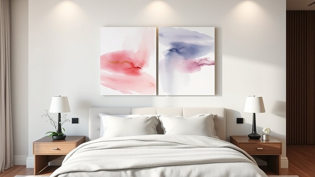
Designing a Cohesive Look With Diptychs and Triptychs
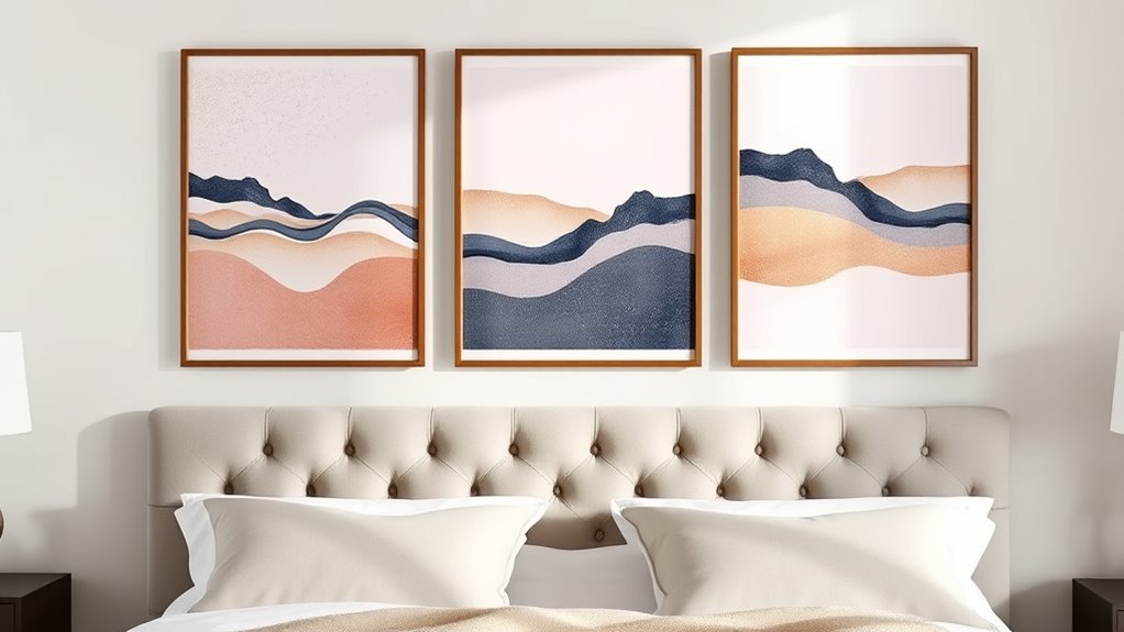
Using multiple artworks like diptychs and triptychs can elevate your bedroom’s design by creating a dynamic, cohesive focal point. To achieve this, focus on color coordination so the pieces complement each other and unify the space. Select frame styles that match or deliberately contrast to add visual interest while maintaining harmony. Consider the following tips:
- Choose a consistent color palette across all panels to enhance cohesion
- Mix frame styles intentionally, such as sleek black frames with ornate gold, to add character
- Ensure the size and spacing of each panel work together to create a balanced look
Arranging Multiple Panels for Visual Impact
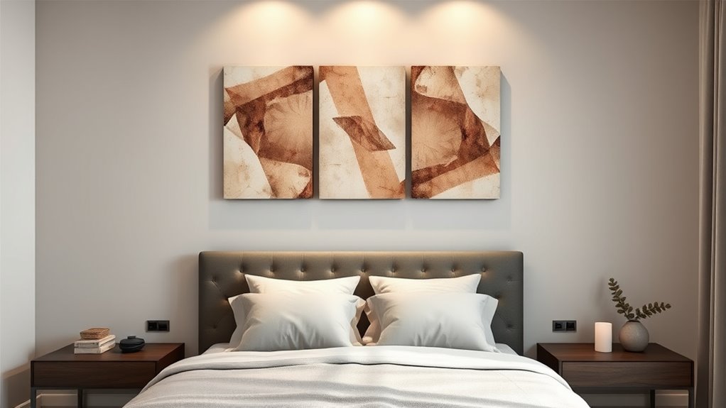
Arranging multiple panels above your bed requires careful planning to create a striking visual impact. Start by considering color coordination; choose artwork that complements your room’s palette for harmony or creates contrast for emphasis. When selecting frames, opt for styles that enhance the artwork and match your decor—sleek and modern or ornate and traditional. Maintain a consistent frame color or material across all panels to unify the arrangement. Varying frame styles can add interest, but keep the overall look cohesive. Think about the overall flow: align panels at the same height and space them evenly. This balance ensures the display feels intentional and polished. Thoughtful color choices and frame selection make your multi-panel arrangement truly stand out above the bed.
Tips for Spacing and Alignment of Wall Art

To achieve a balanced and professional look, pay close attention to the spacing and alignment of your wall art. Proper spacing guarantees your pieces don’t look crowded or disconnected. Use consistent gaps—usually 2-5 inches—between artworks for harmony. When hanging, consider frame materials; lightweight frames may need different hanging techniques than heavier ones. Use a level to ensure your art is straight, and mark your wall with painter’s tape for precise placement. Keep the center of the artwork at eye level for ideal viewing.
- Choose frame materials that complement your room’s decor
- Use appropriate hanging techniques to support weight and prevent damage
- Maintain consistent spacing to unify multiple panels or pieces
Incorporating Personal Style Into Your Art Selection
Your art choices should reflect your personality and taste, making your space uniquely yours. When choosing color palettes, pick hues that evoke the mood you want and complement your existing decor. Don’t shy away from incorporating textures—think layered canvases, mixed media, or tactile materials—that add depth and interest to your wall. Personal style influences everything from subject matter to style, so select pieces that resonate with your experiences or passions. Mixing different textures and colors creates a dynamic visual story that feels authentic. Whether you prefer bold, vibrant art or subtle, muted tones, guarantee your selections echo your personality. By thoughtfully choosing color palettes and textures, you craft a personalized and inviting space that truly reflects who you are.
Frequently Asked Questions
How Do I Choose Art Sizes That Complement Different Ceiling Heights?
To choose art sizes that complement different ceiling heights, consider ceiling height considerations and art size proportion. For high ceilings, opt for larger artworks or multiple pieces like diptychs or triptychs to fill the space and create balance. For lower ceilings, go for smaller, more proportionate pieces that won’t overwhelm the room. Always aim for a harmonious relationship between the artwork size and the wall or ceiling height.
Can I Mix Different Frame Styles Within a Multi-Panel Arrangement?
You can absolutely mix different frame styles within a multi-panel arrangement, and it can create a stunning, eclectic look. To avoid chaos, focus on frame coordination by choosing complementary colors or materials. Style mixing adds visual interest and personality, so don’t worry about matching everything perfectly. Instead, aim for balance and harmony, allowing each piece to stand out while still feeling cohesive in your space.
What Lighting Options Enhance Above-Bed Art Displays?
You should choose wall-mounted lighting to highlight your above-bed art displays effectively. Opt for adjustable sconces or picture lights that focus light directly on the artwork, creating a dramatic effect. Incorporate ambient lighting options like dimmable lamps or LED strips to provide a warm, inviting glow around the bed area. These lighting choices enhance the visual appeal, add depth, and make your art stand out beautifully in any bedroom setting.
How Do I Determine the Ideal Distance Between Panels?
You should aim for about 2 to 4 inches of spacing between panels to guarantee proper panel alignment and a cohesive look. To determine the ideal distance, measure your wall space and consider the size of your art pieces. Keep spacing consistent across all panels to create balance. Use a level and tape measure for accuracy, and step back regularly to assess how the alignment looks from a distance.
Are There Specific Materials Best Suited for Above-The-Bed Art?
You might think choosing materials for above-the-bed art is straightforward, but it’s actually a subtle game. Canvas textures add warmth and depth, making your space cozy, while metal finishes bring sleek modernity and durability. Ironically, the best choices depend on your style and maintenance preferences. Opt for high-quality canvas for softness or metal for a contemporary edge—either way, your art’s material sets the mood, so pick wisely.
Conclusion
Think of your above-the-bed art as the heartbeat of your bedroom’s rhythm. When you choose the right size and arrangement, it sets the tone and keeps everything in harmony. Whether you opt for a single, diptych, or triptych piece, trust your instincts to create a visual melody that reflects your style. With thoughtful placement, your wall art will become the centerpiece that pulls your entire space together, like a symphony in perfect tune.