TL;DR
Paint and color experts are forecasting richer, nature-influenced shades and nostalgic palettes for 2027, including wine reds, mossy greens, grounded roses, warm pastels and periwinkle. These are industry predictions, not confirmed measures of what homeowners will choose. The source lists 10 trend categories but provides detailed descriptions for only some of them.
Paint brands and color specialists are forecasting a more saturated, nature-influenced palette for 2027, with wine reds, mossy greens, complex roses and warm pastels among the predicted home color trends. The projections reflect what experts expect to gain attention; they do not establish how widely homeowners will adopt the shades.

Get furniture and decor delivered free with Prime
- Fast, free delivery on millions of items
- Prime Video, Amazon Music and more included
- Member-only deals all year
The forecasts describe a shift from softer, calming interiors toward colors with greater depth and personality. Reds, yellows and greens are expected to retain their boldness while drawing more directly on natural pigments, plants and minerals. Warm pastels and periwinkle are also identified as possible sources of freshness and playfulness.
Several brand selections illustrate the direction. Benjamin Moore named Webster Green its Color of the Year and included Townsend Harbor Brown in its Color Trends palette. Behr selected the olive-toned Grounded as its Color of the Year, while IKEA’s Wild Fig brings together purple and burgundy notes. Sherwin-Williams included shades such as Cordovan, Secret Green and Roycroft Bronze Green in its forecasts.
The 10 trend labels in the source are wine, mossy greens, grounded roses, neutral browns, stone-based neutrals, complex blues, warm pastels, earthen oranges, mature yellows and periwinkle. The available material provides detailed examples and expert commentary for only some categories, so it does not support a full description of every forecast.
A richer palette is on the horizon for home color in 2027
Paint and color experts expect deeper, nature-influenced and nostalgic shades to gain attention. These are forecasts, not confirmed homeowner choices.
The palette at a glance
The forecast ranges from earthy depth to playful color.
Greens and earth
Mossy greens, neutral browns and stone-based neutrals draw on plants and minerals.
Reds and roses
Wine reds and grounded roses bring warmth and depth.
Blue and pastel
Complex blues, warm pastels and periwinkle offer freshness and playfulness.
Named brand examples
Selections illustrate the direction; each brand’s palette is its own forecast.
| Brand | Named shades |
|---|---|
| Benjamin Moore | Webster Green; Townsend Harbor Brown |
| Behr | Grounded |
| IKEA | Wild Fig |
| Sherwin-Williams | Cordovan; Secret Green; Roycroft Bronze Green |
What is shaping the forecasts?
Experts point to personal meaning, nature and changing ideas about comfort.
Vacation views, childhood homes and vintage textiles inform color choices.
Plants, minerals and natural wood inspire deeper, earthen shades.
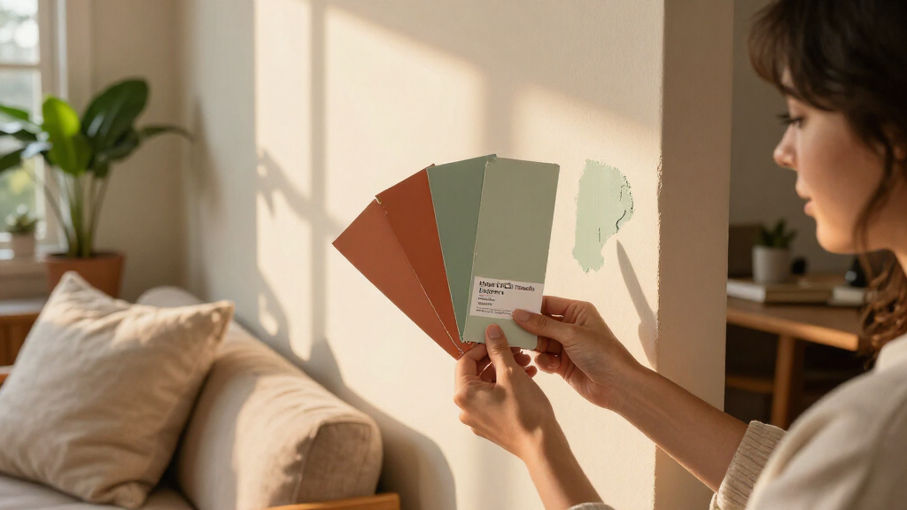
Test colors in the room and lighting where they will be used.
Forecasts have limits
The source names 10 categories but provides detailed examples for only some.
Why Richer Paint Palettes Matter
Color forecasts can shape the options homeowners encounter in paint collections, design coverage and retail displays, although a forecast is not proof of future sales or broad consumer behavior. The predicted palette also suggests a change in how experts describe comfort: rather than relying mainly on pale neutrals, some are pointing to warm, deeper tones as a way to make rooms feel personal and grounded.
For readers planning a repaint, the range offers alternatives to familiar whites and light beiges, from earthy greens and brown-based pinks to berry reds. These are suggestions, not rules; the source emphasizes that personal memories and preferences also influence color choices.
Products Worth Considering

Shark PowerDetect Robot Vacuum and Mop Combo with 60-Day Self-Emptying Base (AV2800ZE)

Philips Hue Play HDMI Sync Box

Arlo Pro Wireless Security Camera, 2K HDR, 6th Generation, 4-Camera Set
As an affiliate, we earn on qualifying purchases.
How Experts Built the 2027 Palette
The forecasts draw on both design influences and individual experience. The source says people are taking cues from places and objects that carry personal meaning, including vacation views, childhood homes and vintage textiles. The resulting nostalgia is presented as a reinterpretation of familiar colors rather than a simple return to older styles.
Brand color announcements provide concrete examples, but each company’s selection is its own forecast. Benjamin Moore’s Andrea Magno described Webster Green as a versatile mid-tone with depth, while Sherwin-Williams color marketing manager Emily Kantz connected green with natural wood tones. Behr’s Kayla Kratz said the idea of comfort is changing toward warmer, more earthen colors. Those views explain the companies’ choices; they do not establish an industry-wide consensus.
““If you had to conjure in your mind the perfect mid-tone green, we really felt that this hits the mark.””
— Andrea Magno, vice president of brand, color and integrated marketing at Benjamin Moore
Forecasts Are Not Consumer Data
The projections describe what paint and color experts expect for 2027, but the material provides no sales figures, survey results or adoption data showing how many homeowners will use these shades. It is also unclear how the listed trends will rank against one another or whether the forecasts will hold across different regions and types of homes.
The supplied source ends partway through its discussion of grounded roses. Although it names 10 categories, it does not include enough detail to explain the examples or evidence behind every category, including the neutral, blue, orange, yellow and periwinkle predictions.
Watch for Brand and Retail Rollouts
As 2027 approaches, paint companies and retailers may bring the forecast shades into product collections, room imagery and decorating guidance. The announced Color of the Year selections offer specific examples to track, including Webster Green, Grounded and Wild Fig. The source does not give release dates for new products or predict which shades will perform best.
For homeowners, the next practical step is to test colors in the room and lighting where they will be used. The forecast is a guide to emerging options, not a guarantee that a shade will suit every space or remain popular.
Key Questions
What home color trends are experts forecasting for 2027?
The source lists wine, mossy greens, grounded roses, neutral browns, stone-based neutrals, complex blues, warm pastels, earthen oranges, mature yellows and periwinkle. It gives detailed examples for only some of those categories.
Which paint colors are named in the forecasts?
Named examples include Webster Green and Townsend Harbor Brown from Benjamin Moore’s selections, Behr’s Grounded, IKEA’s Wild Fig, and Sherwin-Williams shades Cordovan, Secret Green and Roycroft Bronze Green.
Why are deeper colors expected to gain attention?
The experts cited in the source connect the shades to personal expression, nature and changing ideas about comfort. Those are their interpretations, not measured evidence of what all homeowners want.
Are these trends confirmed to be popular with homeowners?
No. They are expert and brand forecasts. The source does not provide consumer surveys or sales data confirming how widely the colors will be adopted.
Source: veranda.com