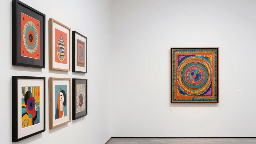

Negative space is the missing ingredient that keeps your gallery wall from feeling cluttered or overwhelming. It gives each piece room to breathe, helping individual artwork stand out while creating a balanced, harmonious look. Negative space also highlights color contrasts and guides your eye smoothly across the display. When you use it thoughtfully, your gallery feels inviting and cohesive. Want to discover how to master negative space for your perfect wall? Keep exploring.

Get furniture and decor delivered free with Prime
- Fast, free delivery on millions of items
- Prime Video, Amazon Music and more included
- Member-only deals all year
Key Takeaways
- Negative space provides necessary breathing room, preventing gallery walls from feeling cluttered or overwhelming.
- Proper negative space emphasizes individual artwork and enhances overall visual harmony.
- Without strategic negative space, contrasting colors and frames can create chaos instead of balance.
- Neglecting negative space reduces the impact of framing and composition principles in the display.
- Incorporating negative space creates a cohesive, inviting gallery that guides viewers comfortably through the artwork.

When designing a gallery wall, understanding the role of negative space is essential to achieving a balanced and visually appealing display. Negative space isn’t just empty gaps; it’s the breathing room that allows each piece to stand out and work together harmoniously. Without enough negative space, your gallery can feel cluttered, overwhelming, and hard to appreciate. By intentionally incorporating negative space, you give your eyes a place to rest, creating a rhythm that guides viewers comfortably through the display. This space helps emphasize the artwork and makes the overall arrangement more cohesive. Recognizing the importance of visual balance can make a significant difference in how your gallery wall is perceived. Color contrast plays a significant role in how effectively negative space works within your gallery wall. When you use contrasting colors, negative space becomes even more critical. A light background around dark-framed artwork, or a neutral backdrop behind vibrant prints, allows the pieces to pop without competing for attention. This contrast draws focus to each item and prevents the display from feeling chaotic. It’s about balancing the boldness of your artwork with enough negative space to let the colors breathe. If you pack every inch with color and pattern, you lose the impact of each piece. Instead, strategic use of negative space enhances the visual contrast, making every detail more striking and memorable. Additionally, understanding composition principles can help you plan your layout more effectively, ensuring that negative space is used intentionally to create a harmonious balance. Thoughtful placement of visual elements can guide the viewer’s eye smoothly from one piece to the next, enhancing the overall aesthetic. Frames also influence how negative space functions in your display. Different frames command different levels of attention, so choosing the right styles can either add to or diminish the importance of negative space. Thin, minimalist frames tend to create a sleek, modern feel, allowing negative space to carry more visual weight. Larger, ornate frames can act as focal points, but they need to be balanced with adequate negative space around them to avoid overwhelming the wall. The key is to think of frames as part of the overall composition—use them to complement the negative space rather than compete with it. When you select frame styles thoughtfully, you create a balanced visual flow that highlights your artwork without clutter. Ultimately, negative space isn’t just an afterthought; it’s a fundamental component of a compelling gallery wall. It gives each piece room to breathe, enhances color contrast, and allows frame styles to work together seamlessly. Understanding the importance of negative space and how it interacts with other design elements can greatly improve the cohesiveness of your display. When you give careful attention to the negative space, your gallery transforms from a collection of images into a cohesive, aesthetically pleasing display that invites viewers to linger and appreciate every detail.
As an affiliate, we earn on qualifying purchases.
Frequently Asked Questions
How Much Negative Space Is Ideal for a Gallery Wall?
You should aim for about 2-3 inches of negative space between your frames to create a balanced look. This allows for effective color coordination and gives each piece room to breathe. Incorporate frame layering to add depth, but guarantee the negative space isn’t overcrowded. Too little space makes the wall feel chaotic, while too much can seem sparse. Find a happy medium to highlight your artwork beautifully.
Can Negative Space Improve the Overall Aesthetic of My Gallery Wall?
Think of negative space as the silent symphony that makes your gallery wall resonate. Yes, it can greatly improve your aesthetic by balancing color coordination and material contrast. It prevents clutter, highlights your favorite pieces, and creates visual harmony. Without it, your wall may feel overwhelming or chaotic. Embracing negative space allows each artwork to breathe, making your display more compelling and sophisticated.
What Are Common Mistakes When Incorporating Negative Space?
A common mistake is neglecting color contrast, which can make negative space feel dull or unbalanced. You might also misalign frames, disrupting flow and harmony. Make sure your negative space isn’t just empty but thoughtfully planned, with contrasting colors to draw attention. Pay attention to frame alignment, keeping it consistent or intentionally varied. This balance helps your gallery wall feel cohesive, avoiding clutter and enhancing visual appeal.
How Do I Balance Negative Space With Different Frame Sizes?
You balance negative space with different frame sizes by thoughtfully arranging your frames, creating a visual rhythm. Use larger frames as anchors, then space smaller ones around them to avoid clutter. Incorporate color coordination to unify the overall look, ensuring that negative space isn’t overwhelmed. Play with asymmetry, letting negative space highlight key pieces while providing breathing room, resulting in a cohesive, balanced gallery wall.
Does Negative Space Affect the Perception of Artwork Sizes?
Yes, negative space influences how you perceive artwork sizes. It enhances visual perception by creating a sense of balance and clarity, helping your spatial awareness to distinguish between pieces. When negative space is properly used, smaller artworks appear more prominent, while larger pieces don’t overwhelm the wall. This deliberate spacing guides the viewer’s eye, making the gallery wall feel cohesive and thoughtfully curated, regardless of the actual sizes of the artworks.
As an affiliate, we earn on qualifying purchases.
Conclusion
So, next time you’re arranging your gallery wall, don’t forget the power of negative space. It’s the secret ingredient that transforms a cluttered jumble into a mesmerizing masterpiece. Leave some areas intentionally empty—let your eyes breathe. But beware: once you experience the magic of negative space, you might never see gallery walls the same way again. Are you ready to discover this hidden design secret and elevate your space? The choice is yours.
negative space wall art arrangement
As an affiliate, we earn on qualifying purchases.
As an affiliate, we earn on qualifying purchases.
As an affiliate, we earn on qualifying purchases.
Fall Picks
fall essentials
As an affiliate, we earn on qualifying purchases.