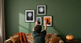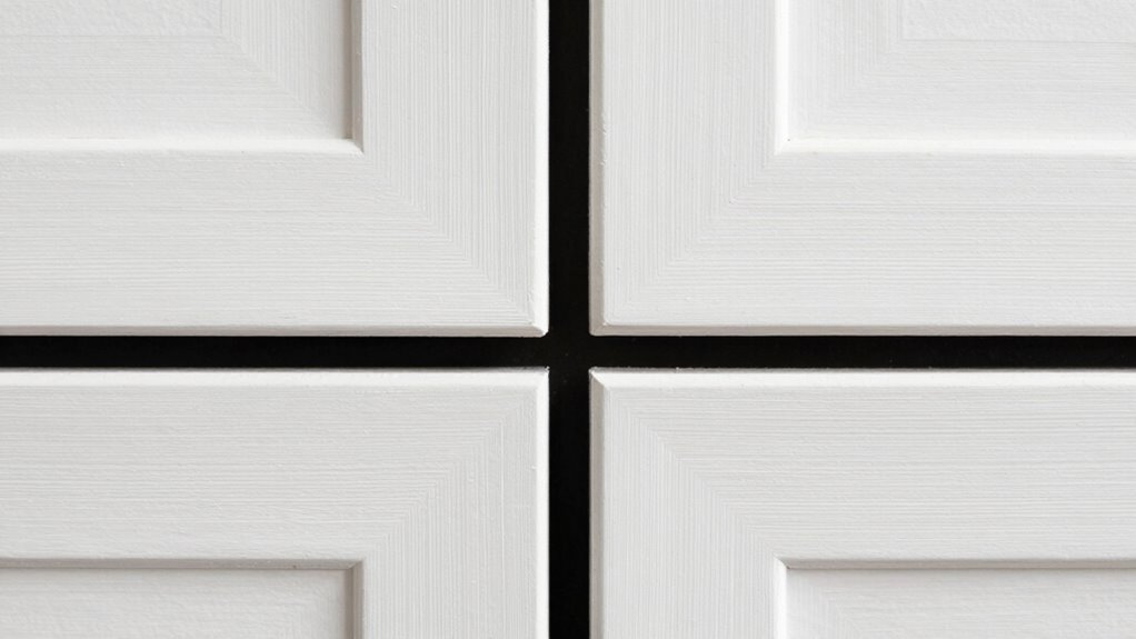

To make your diptych feel custom, focus on the spacing between panels, as it plays a key role in shaping emotion and unity. Narrow gaps create a cohesive, harmonious look, while wider gaps emphasize separation and contrast. Play with how color and framing interact with the spacing to evoke specific moods or themes. Thoughtful adjustments to these details guarantee your artwork feels deliberate and personal. Keep exploring these techniques to fully craft a visually compelling and meaningful diptych.

Get furniture and decor delivered free with Prime
- Fast, free delivery on millions of items
- Prime Video, Amazon Music and more included
- Member-only deals all year
Key Takeaways
- Adjusting the width of the spacing between panels creates a unique visual rhythm tailored to the artwork’s emotional tone.
- Incorporating subtle framing or borders enhances the sense of intentional separation or connection.
- Custom spacing aligns with color transitions, reinforcing harmony or contrast for a personalized feel.
- Precise spacing choices guide viewer perception, emphasizing specific themes or relationships within the diptych.
- Variations in gap size and framing details craft a distinctive narrative style, making the diptych feel intentionally designed.

Have you ever noticed how the spacing between panels in a diptych can influence the overall aesthetic and feel of the artwork? It’s more than just placing two images side by side; it’s about how the gap or connection between them impacts the viewer’s perception. When you’re designing a diptych, you have the power to create a sense of unity or contrast through spacing choices. Narrow gaps tend to unify the panels, making them feel like parts of a single, cohesive story, while wider gaps can introduce a deliberate separation, emphasizing individual elements or themes. This spacing decision directly affects the emotional tone, whether it’s harmony or tension.
Spacing between diptych panels shapes perception, creating unity or contrast to evoke harmony or tension in the artwork.
Color harmony plays an essential role here. When the colors across the panels complement each other, tight spacing enhances the seamless flow, making the artwork feel like a single, continuous piece. Conversely, if you want to highlight contrast, you might deliberately increase the space, allowing the viewer to pause and process each panel separately. The way you handle color shifts—whether smooth or abrupt—interacts with your framing techniques to craft a specific mood. For example, a narrow, close-up framing with a harmonious color palette can evoke intimacy, while a wider gap with contrasting hues might evoke a sense of disconnection or dialogue between different scenes. Additionally, understanding visual perception helps in making spacing choices that effectively guide the viewer’s experience. Recognizing how biodiversity influences visual harmony can also inspire more vibrant and balanced color relationships in your artwork.
Framing techniques also influence how spacing affects the overall piece. You might choose to frame each panel distinctly, using borders or mats to reinforce separation, or opt for a more integrated framing that minimizes visual boundaries. When the frames are subtle or absent, the spacing becomes more critical in guiding the viewer’s eye and establishing relationships between the panels. A carefully considered frame can serve as a visual anchor, balancing the space and ensuring the diptych feels intentional rather than disjointed. Recognizing how artistic composition interacts with spacing can further enhance the visual storytelling. Moreover, thoughtful framing can subtly connect or separate the panels, emphasizing themes of conservation or coexistence within the artwork. It’s also helpful to consider how perception influences how viewers interpret space and relationship within the piece, ensuring your design choices resonate effectively. Additionally, awareness of artistic techniques can help you fine-tune how spacing and framing work together to craft a compelling visual narrative.
Ultimately, the spacing detail is a subtle but powerful tool that makes your diptych feel custom and tailored. It’s about more than just aesthetics; it’s about controlling how viewers experience the artwork’s narrative and emotional resonance. Whether you want the panels to blend seamlessly or stand apart with purpose, your choices in spacing, color harmony, and framing techniques work together to shape the story you tell. This attention to detail transforms a simple two-image display into a compelling, personalized visual statement that feels genuinely crafted for its space.
As an affiliate, we earn on qualifying purchases.
Frequently Asked Questions
How Does Diptych Spacing Affect Overall Artwork Balance?
Diptych spacing directly influences your artwork’s balance by enhancing visual harmony and guiding the viewer’s eye smoothly across both panels. When you adjust the spacing thoughtfully, it creates a seamless compositional flow, preventing the pieces from feeling disjointed. Too much space can disrupt harmony, while too little may clutter the scene. You should aim for a spacing that complements your overall design, maintaining a cohesive and engaging visual experience.
Can Diptych Spacing Be Customized for Different Art Styles?
Yes, you can customize diptych spacing for different art styles. You’ll want to take into account color harmony to guarantee the spacing complements your palette, creating a seamless flow between panels. Additionally, adjusting the spacing allows you to highlight texture contrast, making certain elements pop or blend smoothly. By tailoring the spacing to your style, you enhance the overall aesthetic, making your diptych feel uniquely suited to your artistic vision.
What Tools Are Best for Measuring Diptych Spacing Accurately?
Measuring diptych spacing accurately is like using a surgeon’s scalpel—precise and careful. To do this, you should rely on precision tools like a digital caliper or a fine-tipped ruler, which guarantee exact measurements. Employ measurement techniques such as double-checking with a level or using masking tape to mark consistent spacing. These tools and techniques help you achieve consistent, professional-looking gaps that enhance your artwork’s aesthetic.
Does Diptych Spacing Influence Viewer Perception?
Yes, diptych spacing influences viewer perception by affecting how you experience color harmony and overall balance. When spacing is thoughtfully adjusted, it guides your eye smoothly across the pieces, enhancing engagement. Proper spacing creates a harmonious flow, making the art feel more intentional and inviting. You’ll find that subtle changes in spacing can evoke different emotional responses, making your viewing experience more personalized and impactful.
How Do You Maintain Consistent Spacing in Multiple Diptychs?
To maintain consistent spacing in multiple diptychs, you should plan your gallery arrangement carefully. Use a measuring tool or spacer templates to guarantee equal gaps between each piece. Keep a consistent distance from the edges to create visual harmony across all diptychs. Regularly step back and review your setup to catch any discrepancies, ensuring your display feels cohesive and professionally curated for viewers.
As an affiliate, we earn on qualifying purchases.
Conclusion
As you step back, the carefully measured diptych spacing feels like the quiet pause between whispered secrets and thunderous applause. It’s the deliberate breath between brushstrokes, the subtle gap that invites your eye to linger and connect. In this space, the artwork breathes, alive and personal—like a private conversation captured in art’s silent language. That tiny detail transforms a simple pairing into a custom experience, making your space uniquely yours, one thoughtful gap at a time.
As an affiliate, we earn on qualifying purchases.
As an affiliate, we earn on qualifying purchases.
Halloween Picks
halloween
As an affiliate, we earn on qualifying purchases.