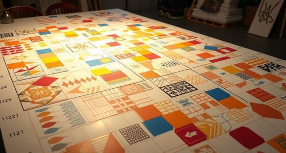

Curating by color with a palette-first approach means starting your design process by choosing a cohesive color palette that guides every decision. This method helps you create harmony, set a mood, and guarantee consistency across furniture, decor, and accents. It simplifies your choices and strengthens the emotional impact of your space. By focusing on color first, you’ll craft environments that feel intentional and balanced—stay with us to explore how this approach transforms your projects.
Key Takeaways
- Starting with a curated palette establishes harmony, cohesion, and visual balance in the overall design.
- A palette-first approach guides decision-making for furniture, decor, and accents, ensuring consistency.
- Color choices evoke specific emotions and atmospheres, shaping the space’s mood intentionally.
- It streamlines the process by reducing indecision and preventing impulsive, discordant selections.
- Utilizing color psychology in palette selection enhances well-being and creates authentic, thoughtful environments.

Choosing colors first can transform your design process by providing a clear foundation for all other decisions. When you start with a well-curated palette, you set the tone for the entire project, making it easier to select furniture, decor, and accents that complement your initial choices. This approach guarantees that every element works harmoniously, creating a cohesive and visually appealing space from the outset. By focusing on color harmony, you can craft a balanced and pleasing environment, avoiding jarring combinations that distract or overwhelm. When you select your palette early, you’re better equipped to maintain consistency, which enhances the overall aesthetic and makes your design feel intentional and polished.
Starting with a curated palette ensures harmony, clarity, and a polished, cohesive design from the very beginning.
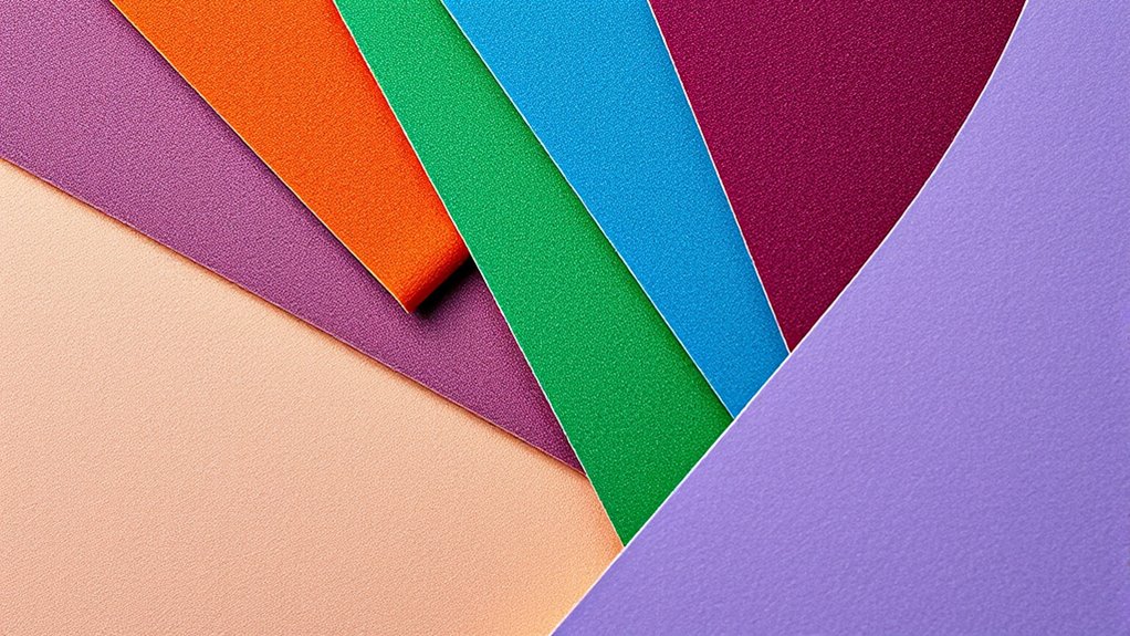
Color selection also plays a vital role in mood creation. Different hues evoke specific emotions and atmospheres, so choosing your palette carefully can help you shape the ambiance you want to achieve. For example, cool blues and greens foster calmness and relaxation, ideal for bedrooms or tranquil workspaces. Warm tones like reds, oranges, and yellows energize a room, making them perfect for social areas or creative studios. When you curate your palette first, you can intentionally select shades that reinforce the mood you aim to cultivate, guaranteeing that your space feels welcoming and aligned with your intentions.
Starting with color also streamlines your decision-making process. Instead of choosing each element in isolation, you have a guiding framework that keeps your choices aligned. This reduces indecision and allows you to focus on how different colors interact and support one another. As you experiment with various shades, you’ll notice how certain combinations evoke specific feelings or visual effects, helping you refine your palette to best fit your vision. Furthermore, a curated palette can serve as a reference point throughout the project, making it easier to stay consistent and avoid impulsive choices that could disrupt the harmony or mood.
Additionally, understanding the impact of color psychology can help you select hues that promote well-being and comfort—especially important in spaces designed for the elderly or those with sensory sensitivities.
Ultimately, choosing colors first empowers you to create a unified design that resonates emotionally and visually. It’s about setting a tone, establishing mood, and shaping perceptions through deliberate color choices. When you prioritize your palette at the beginning, you lay a solid foundation that guides every subsequent decision, making your entire design process more efficient and impactful. This method encourages you to think critically about how colors influence the space, leading to a more intentional, harmonious, and mood-appropriate environment. By starting with color, you’re not just decorating—you’re crafting an experience that feels authentic and thoughtfully curated from the very first stroke.

LNAUJS 8 Pack Plastic Paint Tray Palettes, 6 Well Rectangular Palette, Watercolor or DIY Craft Paint Supplies
Unboxing a Masterpiece: 8 pack color palettes, each boasting 6 spacious wells, crafted to perfection at 3.4×5 inches,…
As an affiliate, we earn on qualifying purchases.
As an affiliate, we earn on qualifying purchases.
Frequently Asked Questions
How Do I Start Creating a Color Palette for My Project?
Start creating your color palette by researching color psychology to understand how different shades evoke emotions. Consider cultural influences that might affect how your audience perceives colors. Gather inspiration from nature, art, or design trends, then select a few core hues. Experiment with combinations, testing how they work together and communicate your message. Keep refining until your palette feels balanced, intentional, and aligned with your project’s goals.
What Tools Are Best for Palette-First Curation?
You’ll find that tools like Adobe Color, Coolors, and Pantone’s digital swatches are perfect for palette-first curation. They make color matching effortless by allowing you to generate harmonious schemes and explore digital swatches that inspire your design. Coincidentally, these platforms often sync with your favorite apps, streamlining your workflow. So, immerse yourself in them, experiment, and let the colors guide your project’s mood and style seamlessly.
How Can I Ensure Color Harmony Across Different Mediums?
You can guarantee color harmony across different mediums by maintaining color consistency through calibrated screens and color profiles, which help adapt your palette accurately. Test your colors on various mediums like print, digital, and fabric to see how they appear, adjusting as needed for medium adaptation. Consistent lighting and viewing conditions also help you accurately judge color harmony, ensuring your palette remains cohesive regardless of the medium.
What Are Common Mistakes to Avoid in Palette Selection?
Avoid overly saturated colors that can overwhelm your design and neglecting contrast, which makes elements blend together. For example, a website with bright, saturated backgrounds and text can strain viewers’ eyes and reduce readability. Always test your palette in different contexts, ensuring there’s enough contrast for clarity. Don’t rely solely on trendy colors—consider how they work together and with your audience to create a balanced, harmonious look.
How Do I Adapt Palettes for Accessibility and Inclusivity?
To adapt palettes for accessibility and inclusivity, prioritize strong color contrast to guarantee readability for all users. Use tools like contrast checkers to verify sufficient differences between text and background colors. Incorporate inclusive design principles by avoiding reliance on color alone to convey information, and consider colorblind-friendly palettes. This approach helps create a more accessible experience, making your content usable and welcoming for everyone.

Color Your Home Coloring Book: You choose how these beautiful interiors and exteriors should look.
As an affiliate, we earn on qualifying purchases.
As an affiliate, we earn on qualifying purchases.
Conclusion
By embracing a palette-first approach, you can create visually cohesive and striking designs effortlessly. Studies show that color consistency increases brand recognition by up to 80%, highlighting its importance. So, next time you’re selecting elements, start with your palette to ensure harmony and impact. Remember, a well-curated color palette isn’t just aesthetically pleasing—it’s a powerful tool that can elevate your entire project. Immerse yourself in color, and watch your creations stand out.

EZVALO Picture Lights for Wall, 2000mAh Rechargeable Battery Magnetic Poster Lights with 3 Color Temps & 12 RGB, Remote Dimmable Timer Painting Light, Wall Decor Light for Art Display, Frame (3 Pack)
2000mAh Long-Lasting Rechargeable Battery: EZVALO picture light uses 6 energy-saving LED lamp beads (others: 4 lamp beads), with…
As an affiliate, we earn on qualifying purchases.
As an affiliate, we earn on qualifying purchases.

Mini Plants for Car Dashboard Decor – Unbreakable Resin Cute Car Accessories Gift for Women, Mini Planter Pots for Rearview Mirror, Center Screen & Air Vent (4-Pack)
【Bring Lifelike Greenery to Your Car Without the Watering】These 4 mini planters are crafted from high-quality, eco-friendly resin,…
As an affiliate, we earn on qualifying purchases.
As an affiliate, we earn on qualifying purchases.