
To make trim and wall colors look deliberately different, choose shades with strong contrast, such as dark trim against light walls or vice versa. Enhance this effect with strategic lighting—use spotlights or layered lighting to highlight the distinction and add depth. Be sure to test colors under different lighting conditions to see how they interact. If you keep exploring, you’ll discover even more ways to craft a stylish, balanced space.
Key Takeaways
- Choose trim and wall colors with noticeable contrast, such as white trim on dark walls or dark trim on light walls.
- Use varying tones or shades within the same color family to create subtle but deliberate differences.
- Enhance contrast with strategic lighting, like spotlights on trim or layered lighting to highlight distinctions.
- Test colors under different lighting conditions to ensure the contrast remains intentional and effective.
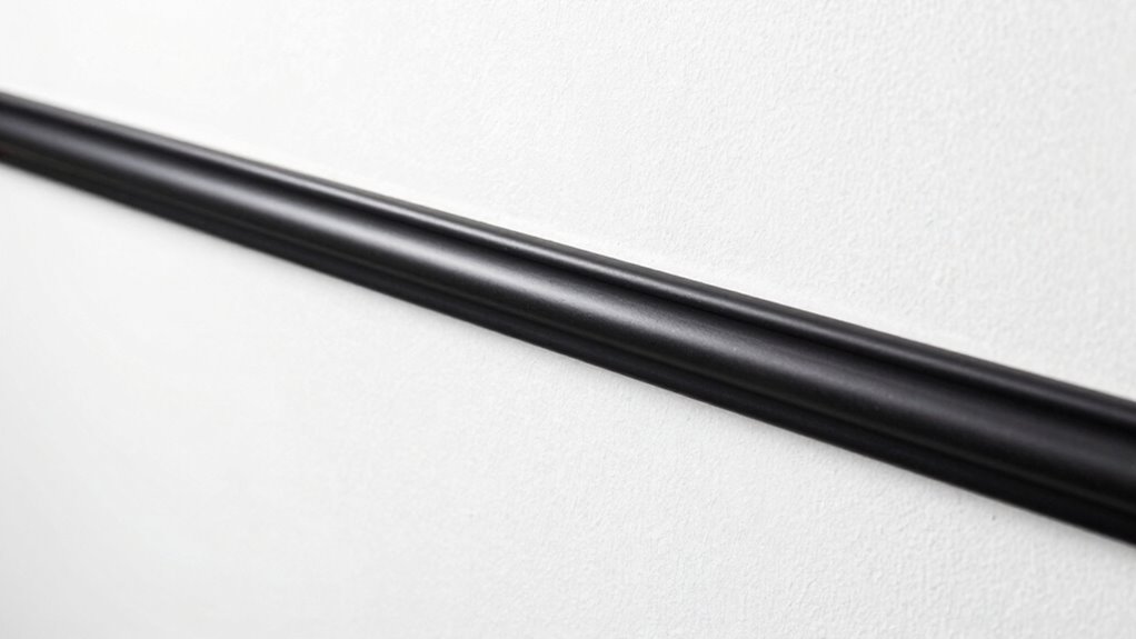
- Incorporate bold or distinctive trim styles that visually stand out from the wall color.
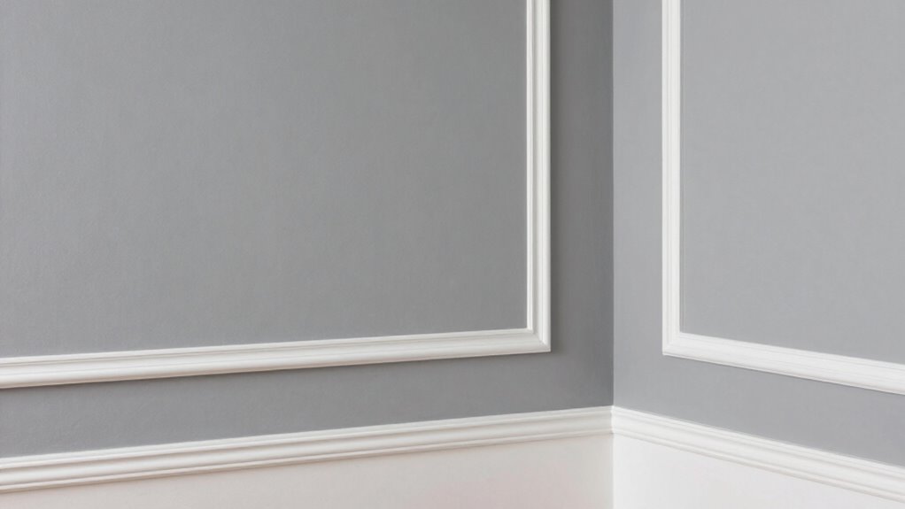
Creating a deliberate contrast between trim and wall colors can instantly elevate your space’s style and personality. When you choose to make these elements distinctly different, you add visual interest and depth that transforms a simple room into something more sophisticated. The key lies in understanding how color contrast and lighting effects work together to highlight your design choices. By selecting contrasting colors, you create a clear boundary that emphasizes the architectural details and adds a sense of purpose to your space.
Deliberate color contrast between trim and walls enhances depth, style, and architectural emphasis in your space.
Start by considering high-contrast color combinations, like crisp white trim against darker, bolder wall colors. This approach draws attention to your trim, making it stand out as a design feature rather than just a finishing touch. Conversely, if you prefer a softer look, opt for subtle contrast, such as light gray walls with slightly darker trim. This creates a more understated yet intentional distinction that still adds depth without overwhelming the room. Whether you choose bold or subtle, the contrast should feel purposeful, guiding the eye and defining the space.
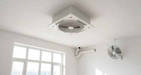
Lighting effects play an essential role in how your color contrast appears throughout the day. Natural light can wash out or intensify colors, so test your chosen shades under different lighting conditions before making a final decision. For example, bright sunlight might make a light-colored wall seem even softer, while shadows can deepen the contrast between trim and walls. Artificial lighting, like warm or cool bulbs, can also influence how colors appear. Warm lighting tends to soften contrasts, making them feel more cohesive, while cooler lighting can sharpen differences, emphasizing your deliberate design choices. Understanding how lighting effects influence color perception can help you make more informed decisions about your room’s ambiance.
To maximize the impact of your color contrast, think about the placement of lighting fixtures. Recessed lights or spotlights aimed at your trim can enhance the contrast and create striking visual effects. Conversely, ambient lighting that evenly illuminates the room can soften the overall appearance, so consider layering your lighting to achieve the desired effect. You want the contrast to be noticeable but balanced, avoiding harshness or visual discord. Additionally, understanding how lighting effects influence color perception can help you make more informed choices about your room’s ambiance. Incorporating lighting techniques can further enhance the visual distinction and add a dynamic element to your space.
Ultimately, the goal is to make your trim and wall color work together intentionally. Use color contrast and lighting effects to craft a space that feels both dynamic and harmonious. By thoughtfully combining these elements, you guarantee your design choices stand out in a way that’s stylish and purposeful. When done correctly, this approach not only elevates your room’s aesthetic but also showcases your attention to detail and personal style. Recognizing the importance of color contrast in interior design can help you achieve a balanced and visually appealing environment.

Rust-Oleum 369384 Advanced Dry Door & Trim Paint, Quart, Satin White
Ready to use, pre-mixed door and trim paint offers a fresh new look on interior or exterior metal,…
As an affiliate, we earn on qualifying purchases.
As an affiliate, we earn on qualifying purchases.
Frequently Asked Questions
Can I Use Different Paint Finishes for Trim and Walls?
Yes, you can use different paint finishes for trim and walls. Using a trim accent finish, like semi-gloss or high-gloss, creates contrast and highlights the trim, while a matte or eggshell finish on the walls fosters wall harmony. This combination adds depth to your space, emphasizing architectural details while maintaining a cohesive look. Just make certain the finishes complement each other and suit the room’s lighting for a polished, deliberate style.
How Do Lighting Conditions Affect Color Contrast?
Think of your room’s colors as a chameleon, changing with its environment. Natural light makes colors appear brighter and more vibrant, while artificial lighting can dull or alter their tone. For example, a soft beige may seem warm in sunlight but cooler under fluorescent bulbs. You need to test your paint colors at different times and lighting conditions to achieve the deliberate contrast you want.
Are There Specific Color Combinations That Work Best?
You should choose color combinations that promote harmony while creating contrast, enhancing visual perception. Complementary colors, like blue and orange, work well because they stand out sharply, while analogous colors, such as green and blue, offer a more subtle difference. Consider the room’s lighting, as it influences how these colors interact. Balancing bold and neutral tones also helps achieve a deliberate yet cohesive look, making your trim and walls visually distinct.
How Can I Test Color Differences Before Painting?
Did you know that 90% of color professionals recommend testing colors before committing? To test color differences effectively, use color swatch testing by painting small patches on your wall. Digital color matching tools also help you visualize how shades will look together. This way, you see the actual results, avoiding surprises, and ensuring your trim and wall colors contrast beautifully, creating the deliberate look you want.
What Tools Are Recommended for Precise Color Application?
You should use painter’s tape and a high-quality brush or roller for precise color application. For better color matching, consider using a color-matching tool or a colorimeter to guarantee consistency. When applying paint, choose the right paint sheen—gloss, semi-gloss, or matte—based on the desired look and durability. These tools and techniques help you achieve clean lines and a professional finish, making your trim and wall colors stand out intentionally.
Rust-Oleum 369384 Advanced Dry Door & Trim Paint, Quart, Satin White
Ready to use, pre-mixed door and trim paint offers a fresh new look on interior or exterior metal,…
As an affiliate, we earn on qualifying purchases.
As an affiliate, we earn on qualifying purchases.
Conclusion
By carefully choosing contrasting or complementary colors and paying attention to finish and lighting, you can make your trim and wall colors stand out intentionally. Remember, about 70% of interior designers agree that well-planned color schemes can dramatically enhance a room’s style. So, don’t be afraid to experiment and trust your eye—deliberately contrasting trim and wall colors can truly transform your space into something uniquely yours.

Catalina Lighting Multipurpose Spotlight Accent Lamp, Desk or Wall Mount Lamp for Office, Living Room, Dorm or Bedroom, Smart Home Compatible, Bulb Not Included, 7.5", Metallic Black
SPOTLIGHT LAMP: A versatile, multi-functional spotlight lamp that makes for an excellent addition to your walls or atop…
As an affiliate, we earn on qualifying purchases.
As an affiliate, we earn on qualifying purchases.

Nobiggie Vertical Glass Ambient Lighting, Mood Light with Soft Layered Glow for Bedroom, Living Room, Desk Decor (Gray, 3-Button)
Vertical Glass Ambient Accent: Nine upright glass tubes on a textured base create depth by day and a…
As an affiliate, we earn on qualifying purchases.
As an affiliate, we earn on qualifying purchases.