
To use complementary colors between open rooms, choose shades that are close in hue but vary slightly in tone or saturation, creating a smooth gradient effect. Use consistent finishes like satin or eggshell across spaces to maintain harmony. Incorporate soft, muted tones to evoke calmness and keep the flow seamless. Blending colors thoughtfully helps define areas without stark boundaries. If you keep exploring, you’ll discover more tips for crafting a visually connected and inviting home atmosphere.
Key Takeaways
- Choose colors with similar undertones to create smooth, harmonious transitions between rooms.
- Use tonal variations of the same hue to subtly shift colors while maintaining cohesion.
- Select consistent finishes, like satin or matte, across connected spaces to unify the look.
- Gradually introduce slightly more saturated or darker shades to guide the eye smoothly between areas.
- Incorporate transitional hues that act as visual bridges, enhancing flow and connection between open rooms.

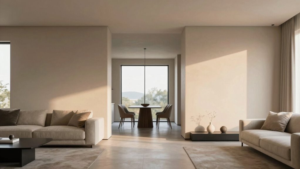
When designing open-concept spaces, choosing the right complementary colors can seamlessly connect different rooms and create a cohesive flow. Transitional colors act as visual bridges, guiding the eye smoothly from one area to another. To do this effectively, you need to understand how color psychology influences mood and perception. Soft, muted tones like warm grays, gentle beiges, or subtle blues can evoke calmness and harmony, making spaces feel connected without overwhelming the senses. Bright or highly saturated colors might be too stark or distracting when placed next to each other, so selecting shades that complement each other psychologically helps establish a unified environment.
Choosing soft, muted tones creates seamless flow and calmness in open-concept spaces.
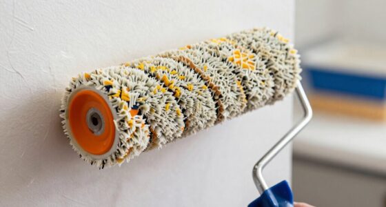
Next, consider the paint finish options when working with transitional colors. Matte finishes absorb light and tend to create a softer, more muted look that pairs well with subtle color shifts, enhancing the sense of flow. Satin or eggshell finishes reflect a bit more light, adding a slight sheen that can make transitional zones feel more vibrant and lively without compromising harmony. Glossy finishes, while stunning in small doses, can sometimes create stark contrasts if used excessively, disrupting the seamless transition you aim for. Ultimately, opting for consistent finish options across rooms helps maintain visual cohesion, ensuring the transition feels natural and intentional. Using a uniform finish across spaces can also help emphasize the visual cohesion, creating a more harmonious environment.
Another important aspect is to choose colors that are close in hue but vary slightly in tone or saturation. For example, a light blue in the living room can transition effortlessly into a slightly deeper navy in the dining area, with both sharing similar undertones. This subtle variation prevents the spaces from clashing while still marking distinct zones. When selecting transitional colors, think of them as a gradient—gradually shifting from one hue to another rather than making abrupt changes. This approach enhances visual flow and softens the boundaries between rooms, encouraging a more open, spacious feeling. Additionally, understanding the concept of color harmony can help you select shades that naturally complement each other and create pleasing transitions.
Incorporating these considerations, you can create a seamless and inviting environment that feels both intentional and harmonious. When combined with thoughtful paint finish options and subtle tonal shifts, these colors will help you craft a harmonious, inviting open-concept home that feels connected yet distinct.
Rust-Oleum 287722 Chalked Ultra Matte Interior Paint, 30 oz, Matte Clear Topcoat
Use on a variety of interior surfaces like wood, metal, ceramic, canvas and easily distress to create a…
As an affiliate, we earn on qualifying purchases.
As an affiliate, we earn on qualifying purchases.
Frequently Asked Questions
How Do Transitional Colors Affect Room Lighting?
Transitional colors influence room lighting by creating subtle shifts in mood and ambiance, guided by color psychology. They soften or enhance lighting effects, making spaces feel more connected. When you choose these hues thoughtfully, they can reflect natural light or artificial illumination, enriching the overall atmosphere. This seamless flow helps rooms feel more harmonious, while also subtly affecting how you perceive brightness and warmth in each space.
Can Transitional Colors Be Used in Small Open-Plan Areas?
Absolutely, transitional colors work wonders in small open-plan areas, like gentle bridges connecting spaces. They create a seamless flow, making your rooms feel bigger and more unified. You’ll want to choose hues grounded in color harmony and boosted by color psychology, such as calming blues or warm neutrals, to evoke comfort and cohesion. These subtle shifts in tone can transform a cramped space into a harmonious sanctuary, inviting relaxation and visual balance.
What Are the Best Tools for Choosing Transitional Hues?
You should use color blending tools like digital color pickers or apps to find harmonious hues. These tools help you select gradual colors that create smooth hue harmony between spaces. A good color wheel or palette generator also allows you to visualize how different shades blend, ensuring your chosen hues complement each other seamlessly. This approach makes it easier to achieve a cohesive flow and balanced look throughout your open-plan areas.
How Often Should I Update Transitional Colors?
You should update your transitional colors every few years, especially if your mood or preferences change. For example, if you notice dullness or a shift in how you feel in a space, it’s time for a refresh. Regular updates reflect current color psychology trends and enhance your mood. This keeps your home feeling fresh, lively, and aligned with your evolving style, ensuring your colors continue to promote positive mood enhancement.
Are Transitional Colors Suitable for All Interior Styles?
Transitional colors suit most interior styles because they promote color harmony and influence mood through color psychology. They help create seamless flow between rooms, whether your style is modern, traditional, or eclectic. You can choose soft neutrals or subtle shades that complement your overall palette. These colors support a cohesive look, making spaces feel connected and balanced, no matter what aesthetic you favor.

EVOLVE Ultimate White Paint & Primer in One, Satin White, 1 Gallon – Interior & Exterior, One-Coat Coverage, Excellent Hide, Low Odor, Low VOC, Washable Paint for Walls, Ceilings & Trim
ALL-IN-ONE PAINT AND PRIMER: Saves time and effort by priming, sealing, and finishing in one step for smooth,…
As an affiliate, we earn on qualifying purchases.
As an affiliate, we earn on qualifying purchases.
Conclusion
So, next time you’re tempted to pick wildly contrasting colors between your open rooms, remember—sometimes the smoothest progressions happen when you’re just a shade or two apart. Ironically, the “perfect” harmony often lies in the subtle, barely noticeable differences, not in bold clashes. You might just find that a gentle color shift creates a more cohesive flow than a dramatic one. After all, who knew that less could be so much more?

LHIUEM Large Abstract Neutral Beige Pastel Framed Canvas Wall Art,Modern Watercolor Lakes Wall Decor,Nature Mountain Minimalist Artwork for Living Room,Bedroom,Dining Room,Office -24"x36"x3
【Abstract Neutral Beige Wall Art】This triptych framed art set features a minimalist, abstract landscape in soft beige and…
As an affiliate, we earn on qualifying purchases.
As an affiliate, we earn on qualifying purchases.

Watercolor Tin Palette Paint Case with 40Pcs White Plastic Empty Half Pans Carrying Magnetic Stripe, Artist Paints Pan Kits for DIY Watercolor Oils or Acrylics Painting Black
WATERCOLOR TIN PAINT CASE: the size is: 17cmx9cmx1.5cm(6.7”x3.5”x0.6”), This tin box can fit 40 half pans are ready…
As an affiliate, we earn on qualifying purchases.
As an affiliate, we earn on qualifying purchases.