You may notice that paint near your baseboards looks heavier because of how lighting and shadows affect perception. The area near the floor often receives less direct light, making it appear darker or more saturated. Shadows also emphasize this lower part, creating a visual boundary that suggests more weight. These effects combined trick your eye into perceiving it as heavier. Keep exploring to uncover more about how color and light influence your interior space.
Key Takeaways
- Higher contrast between baseboards and wall paint creates a visual boundary, making the area appear heavier.
- Shadows near the baseboards darken the paint, enhancing the perception of weight.
- Light hitting upper walls makes the lower areas seem darker and heavier by comparison.
- The interaction of light and shadow emphasizes depth, making paint near baseboards seem more substantial.
- Saturated or darker colors near the baseboards contribute to a heavier visual impression.
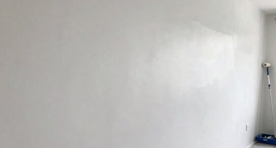
Have you ever noticed that paint near your baseboards seems darker or heavier than the rest of the wall? This common phenomenon can be puzzling, but understanding the role of color contrast and lighting effects can clarify why it happens. When you look at a wall, your eyes interpret shades based on surrounding colors and how light interacts with the surface. Near the baseboards, the paint often appears more intense or heavier because of the way your brain perceives differences in color contrast. The darker or more saturated paint at the bottom creates a visual boundary, making the area seem heavier or more prominent. This is a natural response to how our eyes gauge depth and dimension—our minds tend to emphasize contrasts, especially where there’s a clear demarcation. Additionally, the visual perception** of shadows and contrast can be influenced by the type of lighting and the paint finish used, further enhancing this effect. Lighting effects play a significant role in this perception as well. Usually, the lighting in a room isn’t perfectly even, with some areas receiving more light than others. Light tends to hit the upper parts of the wall more directly, illuminating the color evenly and reducing the appearance of weight or heaviness there. However, near the baseboards, shadows often form, especially if the light source is positioned higher up, like ceiling fixtures or windows. These shadows darken and deepen the paint near the floor, making it look heavier or richer in tone. The difference in brightness and shadow creates a visual depth that tricks your eye into perceiving the paint as darker or more substantial at the bottom. Recognizing how lighting and shadows influence perception can help in choosing paint colors and finishes to achieve your desired room effect. Being aware of these effects can also guide you in selecting the right paint finish** to balance the visual weight throughout a space. Understanding these lighting effects is crucial for effective interior design and achieving a balanced aesthetic in your room. Additionally, knowing how color contrast impacts visual perception can help you plan your painting projects more effectively for a harmonious look.

FAVOMOTO 1 Set Paint Sample Cards, Standard 83 Colors Sample Cards Architecture Paint Bulk Collections Fan Deck Paper for Home Design and Decorating
Professional Paint Color Cards Set: This bulk collection of paint colors cards features 83 standardized shades, perfect for…
As an affiliate, we earn on qualifying purchases.
As an affiliate, we earn on qualifying purchases.
Frequently Asked Questions
How Can I Prevent Paint Buildup Near Baseboards?
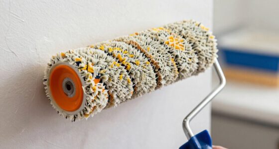
To prevent paint buildup near baseboards, you should use precise edging techniques, like painter’s tape, to create clean lines. Focus on maintaining an even application and avoid excess paint near the edges. Choosing a color contrast that complements your wall and baseboard colors can also help. Carefully remove the tape before the paint dries to prevent smudges, ensuring a neat, professional look with balanced coverage.
Does Lighting Affect the Appearance of Paint Near Baseboards?
Lighting can dramatically influence how paint near baseboards appears. Shadows cast by angles of light create a vivid contrast, making darker paint seem even heavier and more pronounced. Think of lighting as a painter’s brush, emphasizing or softening color contrast and shadow effects. To prevent this, guarantee consistent, diffuse lighting in your space. This way, you’ll see the true color, avoiding misleading shadows that exaggerate the paint’s heaviness.
What Paint Types Are Best for Close to Baseboards?
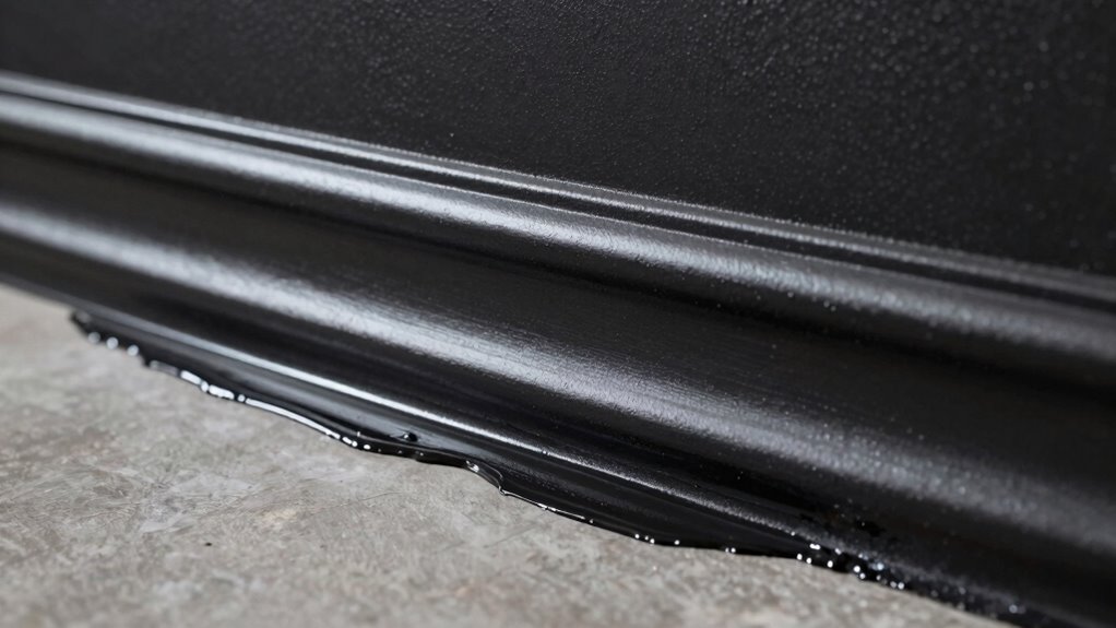
You should choose semi-gloss or satin paint for close to baseboards because their higher sheen enhances edge precision and minimizes the heavier look. These sheens reflect more light, making the paint appear more uniform and clean along the edges. Avoid flat or matte finishes near baseboards, as they tend to create softer, less defined lines, which can make the area look heavier or uneven.
Can Primer Help Reduce Paint Heaviness at Baseboards?
Think of primer as a magic wand that can tame the heaviness near your baseboards. It reduces paint absorption, helping the paint lay down more evenly, and enhances the paint sheen for a smoother finish. Using primer before painting prevents the paint from soaking in too much, which can make it look heavier. As a result, your baseboards will appear cleaner, more consistent, and less weighed down by excess paint.
How Often Should I Reapply Paint Near the Baseboards?
You should reapply paint near the baseboards every 3 to 5 years, depending on wear and tear. When doing so, consider the color contrast and surface texture, as these factors influence how fresh paint appears. If the contrast between the baseboards and walls becomes more pronounced or the surface texture shows through, it’s time for a touch-up. Regular maintenance keeps the area looking clean and cohesive.

Wall Paint, 17.64oz White Touch-up Paint for Walls with Roller Brush, Water-Based and Low Odor Wall Repair Kit Apply for Walls and Ceilings, Ready to Use Interior Paint, Covers Stains, Graffiti
High Coverage Wall Repair: Provides reliable, high-coverage performance to effectively conceal scratches, stains, and minor imperfections, delivering visible…
As an affiliate, we earn on qualifying purchases.
As an affiliate, we earn on qualifying purchases.
Conclusion
Next time you step back to admire your freshly painted room, notice how that darkened strip near the baseboards feels like a shadow cast by your effort. It’s as if the paint there gathers a bit of the room’s weight, anchoring the space. But with a steady hand and a keen eye, you can even out those heavier edges, transforming your walls into a seamless flow of color—light, airy, and perfectly finished.

Joosenhouse Modern LED Wall Sconces Up and Down Wall Mount Light Black 3000K Warm White Wall Lights Set of 2, Indoor Wall Lighting for Hallways, Bedrooms, Hallways, Living Room Indoor Wall Lights
Modern Design:The design of the black wall sconce matches with all kinds of scenes, which not only illuminates…
As an affiliate, we earn on qualifying purchases.
As an affiliate, we earn on qualifying purchases.

Rust-Oleum 369384 Advanced Dry Door & Trim Paint, Quart, Satin White
Ready to use, pre-mixed door and trim paint offers a fresh new look on interior or exterior metal,…
As an affiliate, we earn on qualifying purchases.
As an affiliate, we earn on qualifying purchases.