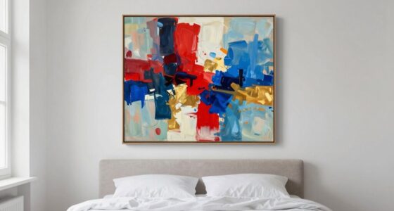
To make mismatched art feel cohesive, use symmetry to create balance and harmony. Arrange your pieces around a central axis, aligning their centers or mirror-images to unify different styles and sizes. Consistently spacing and framing artworks also help anchor the display. By focusing on symmetry, you’ll craft a polished, intentional look that ties everything together effortlessly. Keep exploring to discover more simple tricks for transforming your art wall into a cohesive masterpiece.

Get furniture and decor delivered free with Prime
- Fast, free delivery on millions of items
- Prime Video, Amazon Music and more included
- Member-only deals all year
Key Takeaways
- Use a central axis to align and mirror artworks for visual balance.
- Arrange pieces symmetrically around a shared focal point or imaginary line.
- Balance large and small artworks evenly on either side of the symmetry line.
- Coordinate color palettes to unify mismatched pieces within the symmetrical layout.
- Select consistent framing styles to reinforce cohesion across diverse artworks.

Have you ever wondered how to make mismatched art pieces look intentionally cohesive? The key lies in understanding and applying a simple yet powerful trick: symmetry. When you use symmetry thoughtfully, you create a visual harmony that ties diverse artworks together, making your display feel curated rather than chaotic. It’s all about balancing the elements so that your eye naturally flows across the arrangement without feeling overwhelmed or disjointed.
One of the most effective ways to achieve this is through color balancing. Even if your pieces differ in style or subject matter, using a consistent color palette helps unify the display. Think about selecting artworks with similar tones or accent colors that complement each other. For example, if one piece features warm oranges and browns, incorporate other pieces that include those hues or neutral shades to create a cohesive look. This doesn’t mean everything has to match exactly, but maintaining a palette ensures the artworks work together rather than clash. Understanding visual harmony is essential for creating a balanced and aesthetically pleasing arrangement.
Using a consistent color palette unites mismatched art pieces into a cohesive and intentional display.
Frame selection also plays a crucial role in creating this sense of cohesion. When choosing frames, aim for consistency in style, color, or material. For example, if you opt for sleek black frames, stick with that choice across all your pieces, even if the artworks themselves are quite different. Alternatively, mixing frame styles can work if you keep their sizes and proportions similar, or if they share a common element such as matte finishes or metallic accents. Symmetrical framing arrangements—like lining up the edges or hanging in mirrored pairs—reinforce the visual balance and make mismatched pieces feel intentionally curated.
Positioning your art is just as important as choosing the right frames and colors. Use symmetry to your advantage by arranging your pieces in balanced groups or mirrored layouts. For instance, hanging two larger pieces side by side with smaller works flanking them creates a visual anchor that draws the eye. Even if the artwork varies in size, maintaining an imaginary central axis or aligning their centers can help establish order within the chaos. Understanding visual harmony is essential for creating a balanced and aesthetically pleasing arrangement. Paying attention to proportional spacing ensures that each piece has enough room to breathe and contributes to the overall symmetry. When all elements are thoughtfully spaced, the display feels intentional and polished, rather than cluttered or haphazard. Ultimately, the trick is to think of symmetry as your guiding principle. By balancing color, selecting similar frames, and arranging your artworks thoughtfully, you transform mismatched pieces into a harmonious display. The result is an intentionally eclectic, yet unified, art wall that feels both dynamic and cohesive. When you master this symmetry trick, your mismatched art collection will look polished and purposeful, elevating your space with minimal effort.
As an affiliate, we earn on qualifying purchases.
Frequently Asked Questions
Can Symmetry Work With Abstract or Non-Traditional Art Styles?
Yes, symmetry can work with abstract or non-traditional art styles if you focus on color harmony and visual balance. By mirroring shapes, colors, or patterns, you create a sense of cohesion even in unconventional compositions. This approach guides the viewer’s eye and makes mismatched elements feel intentional and harmonious. Experiment with different symmetrical arrangements to see how they enhance your abstract art, making it more unified and visually appealing.
How Do I Choose the Right Type of Symmetry for My Space?
You should choose a symmetry type based on your space’s color balance and focal points. For example, in a living room with a bold focal point like a fireplace, mirror symmetry creates harmony by emphasizing that feature. If your space has a balanced color scheme but multiple focal points, consider asymmetrical or radial symmetry to distribute visual weight evenly. Match the symmetry to your room’s mood and the art’s impact.
What Tools Can Help Create Symmetry in Mismatched Art?
You can use tools like a ruler, level, or painter’s tape to create visual balance and maintain symmetry. Digital design apps or photo editing software also help align mismatched art by adjusting color harmony and positioning. These tools help you experiment with placement, ensuring the artwork feels cohesive. Focus on balancing colors and shapes, and use symmetry to unify diverse pieces, making your space feel harmonious and well-arranged.
Does Symmetry Apply to Digital or Framed Art Differently?
Symmetry applies to digital and framed art differently, but both benefit from digital balance and framing harmony. In digital art, you can easily adjust elements to create perfect symmetry or balance, making mismatched pieces feel cohesive. For framed art, focus on framing harmony—using similar frames or aligning artwork visually helps attain balance. Whether digital or physical, maintaining these principles ensures your mismatched art looks intentional and harmonious.
How Can Symmetry Improve the Emotional Impact of Mismatched Art?
Did you know that symmetrical art can increase emotional resonance by up to 40%? When you use symmetry, you create a sense of balance and harmony, which helps mismatched art pieces feel more cohesive. This visual consistency draws viewers in emotionally, making the entire display more impactful. By intentionally incorporating symmetry, you enhance the emotional connection, transforming mismatched pieces into a unified, compelling collection that evokes a deeper emotional response.
As an affiliate, we earn on qualifying purchases.
Conclusion
Now that you’ve seen how symmetry can unify mismatched art, imagine what’s possible when you apply this trick creatively. It’s a simple tool with the power to transform chaos into harmony—yet, there’s more to explore. Will you discover new ways to wield this technique, or stumble upon unexpected surprises? The secret lies just beyond the obvious, waiting for you to access it. Are you ready to see your space in a whole new light?
As an affiliate, we earn on qualifying purchases.
As an affiliate, we earn on qualifying purchases.
Halloween Picks
halloween
As an affiliate, we earn on qualifying purchases.