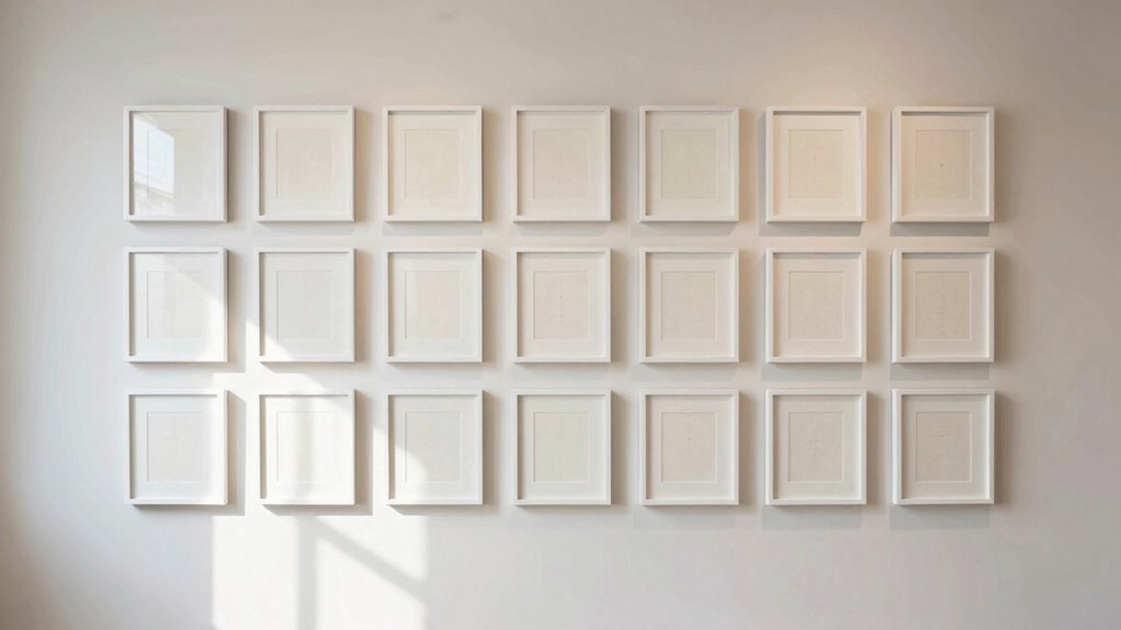
To calm a gallery wall with repetition, start by repeating key elements like colors, shapes, or motifs to create visual harmony. Use consistent frames or motifs to anchor diverse artwork and guide the eye smoothly across the display. Distribute visual weight evenly by balancing larger pieces with smaller, similar elements. This approach fosters a soothing, balanced atmosphere. Keep exploring how these techniques come together for a serene, cohesive look if you want to learn more.
Get ready for Prime Big Deal Days — try Prime free
Exclusive member deals on October 6–7, plus fast free delivery. Cancel anytime.
As an affiliate, we earn on qualifying purchases.
Key Takeaways
- Repeat a consistent color palette throughout artwork and frames to create a calming, cohesive look.
- Use similar shapes or motifs across pieces to establish visual rhythm and harmony.
- Maintain balanced spacing and include varied sizes to distribute visual weight evenly.
- Incorporate repeated design elements, like borders or patterns, for unified visual flow.
- Limit the number of different styles or colors to prevent clutter and promote serenity.
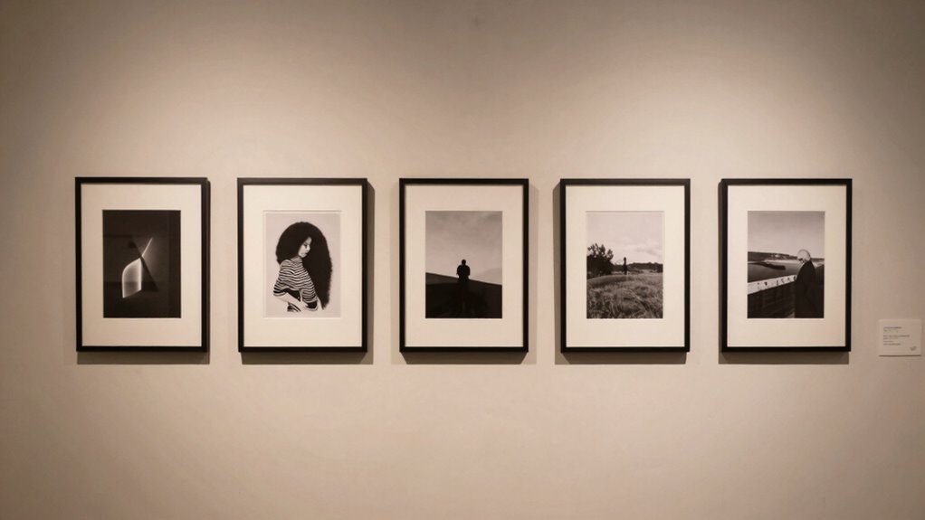
A gallery wall can add personality and visual interest to any space, but without careful planning, it can also feel chaotic or overwhelming. To prevent that, using repetition is one of the most effective strategies you can employ. Repetition creates a sense of rhythm that guides the eye smoothly across the wall, promoting visual balance and making the display feel cohesive rather than cluttered. One way to achieve this is by repeating specific elements, such as frame styles, colors, or motifs, which anchors varied artwork into a unified composition. When you choose a common element—say, black frames or white mats—you establish a visual language that ties everything together, making the overall look more harmonious.
Color harmony plays an essential role here. Repeating a particular color palette throughout the gallery wall helps establish a calming environment, especially when paired with consistent frame finishes and artwork styles. For example, if you select a set of artwork that features muted blues and soft neutrals, repeating these colors will create a soothing flow that prevents the eye from jumping chaotically from piece to piece. This repetition of color ensures that even if the artwork differs in subject matter or size, they still relate to each other aesthetically, resulting in a sense of unity. When you use a limited palette and repeat it intentionally, your gallery wall looks intentional and balanced, rather than haphazard.
Visual balance is another key aspect. Repetition helps distribute visual weight evenly across the wall, preventing certain areas from feeling too crowded or too sparse. For example, if you have a larger piece or a bold-colored artwork, balance it out by repeating similar elements elsewhere in the arrangement. You might position smaller pieces with similar colors or shapes around it, creating a rhythmic pattern that feels stable. Such repetition fosters a sense of order, making the entire display feel intentionally curated. Keep in mind that symmetry isn’t always necessary—repetition can be more organic, as long as it’s thoughtfully applied to maintain harmony and balance. Additionally, repetition can highlight visual motifs, giving your gallery wall a thematic coherence that enhances its overall appeal. Incorporating repetition of shapes can also help emphasize certain design elements, creating visual harmony throughout the display. Recognizing the importance of visual rhythm can further enhance the overall cohesiveness of your gallery wall.
In essence, repetition acts as a visual anchor, linking different elements into a cohesive whole. It allows you to experiment with variety while still maintaining control over the overall aesthetic. When you carefully repeat key elements like color, framing, or motifs, you develop a gallery wall that’s lively yet calming—one that invites viewers to explore without feeling overwhelmed. This approach transforms your wall into a curated artful collection that feels both dynamic and balanced, making your space more inviting and visually satisfying. Incorporating consistent design principles ensures your gallery wall maintains a harmonious appearance while allowing for creative expression.

BSRHOME 12×12 Picture Frame Set of 9, Display Pictures 8×8 with Mat or 12×12 without Mat, Multi Collage Gallery Square Photo Frames for Wall or Tabletop, Black
- Modern Minimalist Design: Natural black, white, and brown colors
- Versatile Display Options: Wall or tabletop display with hooks
- High-Quality Materials: Lightweight, durable PS and plexiglass
As an affiliate, we earn on qualifying purchases.
As an affiliate, we earn on qualifying purchases.
Frequently Asked Questions
What Are the Best Colors to Use for Repetition?
The best colors for repetition are neutral shades like whites, grays, and beiges, as they create a calming effect and promote color harmony. You can also choose analogous colors for visual consistency, which blend seamlessly and soothe the eye. Soft pastels or muted tones work well too. Stick to a cohesive color palette, and you’ll establish a tranquil, balanced look that unifies your gallery wall.
How Do I Choose the Right Frame Styles?
Choosing the right frame styles brings harmony and charm to your gallery wall. You should consider matting options that complement your artwork and create visual consistency. Opt for frame materials like wood or metal that match your room’s vibe—warm woods for coziness, sleek metals for modernity. Mixing textures can add interest, but maintain a cohesive look by sticking to a few key styles. Trust your instincts to create a calming, unified display.
Can Repetition Work in Small or Narrow Spaces?
Yes, repetition works well in small or narrow spaces by creating symmetry patterns that bring order. You can use similar frames or artwork to establish visual rhythm, making the area feel more cohesive and calming. Repetition guides the eye smoothly along the wall, preventing clutter. Even with limited space, consistent elements help balance the visual weight, making your gallery wall feel intentional and serene.
How Do I Balance Repetition With Visual Interest?
You can strike a delicate balance between repetition and visual interest by focusing on symmetry balance and visual rhythm. Use repeated elements to create harmony, but vary sizes, textures, or colors to keep things engaging. Think of repetition as a gentle heartbeat—steady yet lively. This approach guides the eye smoothly across your gallery wall while maintaining excitement, ensuring your display feels cohesive without becoming monotonous.
What if My Artwork Varies in Size and Shape?
If your artwork varies in size and shape, you can still achieve balanced art placement by focusing on the visual flow. Arrange larger pieces first, then fill in gaps with smaller or differently shaped artworks, repeating certain colors or motifs to create harmony. This approach maintains cohesion while allowing variety, making your gallery wall feel intentional and calming. Consistent spacing between pieces also helps enhance the overall visual flow.
repeating color palette wall art
As an affiliate, we earn on qualifying purchases.
As an affiliate, we earn on qualifying purchases.
Conclusion
By embracing repetition, you create a steady heartbeat on your wall, transforming chaos into calm. Each repeated element acts as a gentle reminder that harmony is found in consistency, much like a steady drumbeat guiding your space’s rhythm. When you align your gallery with this quiet rhythm, you craft a sanctuary where every piece speaks in unison, symbolizing balance and peace. Remember, in repetition, you find not just order, but a reflection of your inner serenity.
As an affiliate, we earn on qualifying purchases.
As an affiliate, we earn on qualifying purchases.
Evergreen bestsellers Picks
bestsellers
As an affiliate, we earn on qualifying purchases.