
Paint cards often lie because they are made for controlled environments and don’t account for your specific wall conditions. Lighting, texture, and surrounding colors change how a shade looks once applied. Small test patches can differ from larger areas, and application techniques or drying conditions also impact the final result. If you’re curious about how to truly see how a color will appear in your space, keep exploring this topic further.
Key Takeaways
- Paint cards are tested in controlled environments and don’t account for actual wall textures or lighting conditions.
- Color appearance can change once the paint is applied in larger quantities or on different surfaces.
- Variations in application technique, coats, and drying affect the final sheen and color consistency.
- Environmental factors like lighting and surrounding colors influence how the paint looks on your wall.
- Small test patches are essential, as paint cards can’t fully predict the final look in real-world settings.
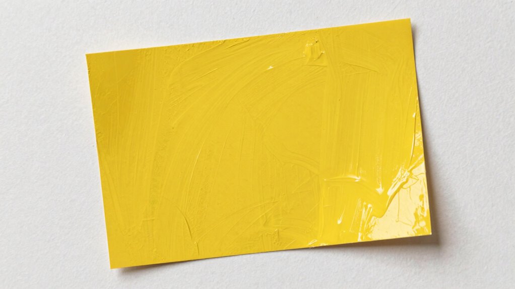
Paint cards often promise a true representation of color, but in reality, they can be misleading. When you’re choosing a paint color, these cards seem to offer a quick, reliable preview—yet once the paint hits your wall, things often look quite different. The main reason is that paint cards are designed to showcase the color in a controlled environment, not your unique space. This means factors like lighting, wall texture, and surrounding colors can dramatically alter how the paint appears in your home.
Paint cards can be deceptive; lighting and wall texture significantly change how colors look in your space.
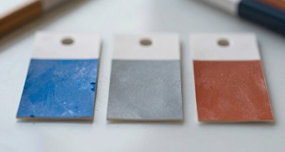
Color consistency is one of the biggest issues with paint cards. The swatches on the card are usually carefully prepared samples, but they don’t always reflect how the color will look once applied in larger quantities or on different surfaces. When you purchase a gallon and paint your wall, the color can shift or appear duller than what you saw on the card. This inconsistency stems from differences in how the paint interacts with your wall’s material and surface texture. Even if the color looks perfect on the card, it might not match your expectations once applied. That’s why it’s *essential* to test paint samples on your actual wall before committing to a final decision. Color accuracy can vary significantly depending on these factors, making it crucial to see the true color in your space.
Finish accuracy is another common point of confusion. Paint cards typically showcase a specific finish—matte, satin, semi-gloss, or gloss—but the actual finish you get after painting might differ. This is because the finish’s appearance can vary depending on application techniques, the number of coats, and drying conditions. If you’re expecting a smooth, velvety matte based on the card, you might find that your wall has a slightly different sheen once it’s dry. Finish accuracy can be compromised if the paint isn’t applied consistently or if environmental factors interfere during drying. Additionally, lighting conditions can further influence how the finish appears once the paint is dry. The perception of color and sheen can also be affected by the surrounding environment, which paint cards cannot replicate. Inconsistent application techniques can also lead to variations, making it even more important to conduct small test patches. Furthermore, understanding how different lighting can affect the appearance helps in making a more informed decision.
All these discrepancies highlight that paint cards are useful starting points but shouldn’t be your only reference. They offer a visual guide, yet they don’t account for the real-world variables that impact how a color looks on your wall. To avoid surprises, always test a small patch of your chosen color in the actual space. This way, you get a more accurate sense of the true color, its finish, and how it interacts with your room’s lighting. Relying solely on paint cards can lead to frustration when the final result doesn’t match your expectations, so take the extra step to see the real deal before making a big commitment.

Mighty Board Minis Polystyrene Paint Color Test Panels, 12" x 9", Set of 5, White
PERFECT SAMPLES: These 12" x 9" white, styrene panels provide a smooth, warp-free surface for testing up to…
As an affiliate, we earn on qualifying purchases.
As an affiliate, we earn on qualifying purchases.
Frequently Asked Questions
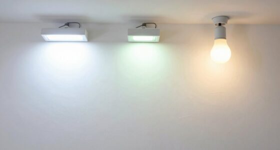
Can Lighting Change How Paint Colors Appear on My Wall?
Yes, lighting can change how paint colors appear on your wall. Different light sources have varying color temperatures, which influence how colors look. Warm light, with a lower color temperature, can make colors appear cozier and softer, while cool light emphasizes brightness and clarity. Light reflection also affects color perception; shiny surfaces reflect more light, potentially altering how the paint color looks in different lighting conditions.
Do Different Paint Brands Have Consistent Color Matches?
Think of color matches like a symphony – no two brands play exactly the same tune. While some brands excel in color consistency, others may vary, and paint durability can differ as well. You might find a perfect match today, but it could fade or shift over time. Always test a small area first, and don’t assume all brands will stay true to their original hue on your wall.
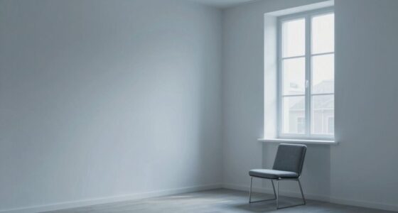
How Does Wall Texture Affect Color Perception?
Wall texture greatly impacts how you perceive color due to texture illusions and visual distortion. Rough or uneven surfaces can make colors appear darker or lighter than they actually are, while smooth finishes show true hues more accurately. When you paint textured walls, expect the color to shift slightly because the surface influences light reflection. So, always consider texture effects when choosing your paint color to guarantee it looks right on your wall.
Are Certain Colors More Prone to Fading Over Time?
You might notice certain colors fade faster over time, especially vibrant reds or bright yellows. This happens because some pigments have lower stability, affecting color longevity. Colors with better pigment stability resist fading longer, maintaining their vibrancy. It’s a coincidence that some shades seem to lose their luster quickly, but understanding pigment stability helps you pick hues that stay fresh longer, ensuring your wall remains lively for years.
What Role Does Surrounding Décor Influence Paint Color Appearance?
Your surrounding décor considerably influences how paint colors appear, shaped by color psychology and cultural influences. When you choose furniture, art, or accessories, they can enhance or mute certain hues on your walls. Bright, warm colors may feel more inviting with cozy textiles, while cool tones can seem more calming amid minimalistic decor. Being mindful of these elements helps you select colors that truly resonate with your space’s vibe.

FoamPRO 120 Color Tester Sample Board – Paint Sample Boards for Comparing & Matching Colors – Portable Wall Paint Tester Sheets – 24-Pack
PAINT COLOR SAMPLE BOARDS – Organize paint colors while exploring and comparing them effortlessly with this 24-pack paint…
As an affiliate, we earn on qualifying purchases.
As an affiliate, we earn on qualifying purchases.
Conclusion
You might be surprised to learn that 78% of homeowners find their wall paint looks different from the paint card sample once applied. This is because paint cards often lie—they can’t capture how lighting, surface texture, and surrounding colors affect the final look. So, don’t rely solely on those small swatches. Instead, always test a larger patch on your wall first. It’s the best way to guarantee your chosen color truly matches your vision.

COLOR MUSE Colorimeter – Mobile Color Matching Tool – Instantly identify closest matching paint colors, products, and digital color values
SIMPLE AND PORTABLE – Scan any flat surface to find the closest matching paint colours and products in…
As an affiliate, we earn on qualifying purchases.
As an affiliate, we earn on qualifying purchases.

Testors Acrylic Value Finishing Paint Set – 9196T,Multicolor
Ideal for use on wood plastic paper metal canvas plaster and more
As an affiliate, we earn on qualifying purchases.
As an affiliate, we earn on qualifying purchases.