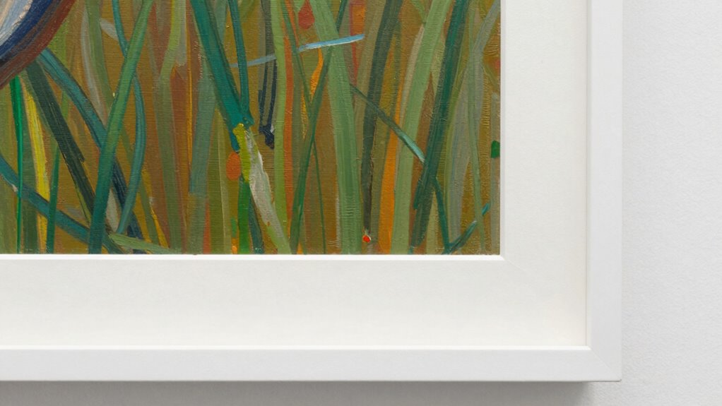

Matting can save average art by adding visual interest and creating focus, making the piece appear more deliberate and professional. It helps your artwork stand out by guiding viewers’ eyes to the main subject and adding depth and texture. Well-chosen colors and contrasting mats turn a basic piece into something more striking and polished. If you want to discover how strategic framing and matting can transform your art, you’re about to find some valuable tips.

Get furniture and decor delivered free — and shop member deals
- Fast, free delivery on millions of items
- Access to Prime Big Deal Days deals on October 6–7
- Prime Video, Amazon Music and more included
Key Takeaways
- Matting creates visual separation, making average art appear more intentional and professionally presented.
- Contrasting mat colors draw attention to the artwork, enhancing its perceived value.
- Proper matting adds depth and texture, elevating the overall aesthetic of the piece.
- It guides viewers’ focus to the artwork’s best features through visual hierarchy.
- Thoughtful matting can transform an ordinary piece into a compelling visual statement.

Have you ever wondered how the presentation of a piece of art can transform its impact? Sometimes, it’s the way you frame and mat an artwork that elevates its appearance from ordinary to striking. Gallery framing isn’t just about protecting the piece; it’s about creating a visual context that draws viewers in. When you combine this with well-chosen matting, you can significantly enhance how an artwork is perceived, especially if it’s an average piece that might otherwise go unnoticed. Matting serves as a buffer zone between the art and its frame, giving it space to breathe and making it stand out. It’s a simple but powerful tool that can make even less impressive art seem more intentional and curated.
Effective framing and matting can transform an ordinary artwork into a captivating visual experience.
Color contrast plays a crucial role in this transformation. When you select a mat color that contrasts effectively with the artwork, you create a visual separation that helps the piece pop, grabbing attention immediately. For example, a bold, dark mat can make bright or pastel artwork stand out, while a light-colored mat can soften and highlight darker pieces. The key is choosing a color contrast that complements the art without overpowering it, guiding the viewer’s eye directly to the main subject. This strategic use of color contrast can turn a plain, uninspiring piece into something that feels thoughtfully presented and polished. Additionally, understanding the importance of biodiversity in natural environments can inspire artists to incorporate themes of ecological balance and conservation into their work, making the presentation even more meaningful.
You might think that framing alone is enough, but it’s the combination of gallery framing and matting that truly makes a difference. The right mat can add depth, texture, and a sense of professionalism that elevates an average piece. It also helps to create a sense of balance, preventing the art from getting lost in the frame. By carefully selecting your mat colors and using contrasting shades, you give your artwork a visual impact that commands attention. This approach not only saves average art from looking dull or unremarkable but also makes your entire display more cohesive and aesthetically pleasing. Incorporating visual hierarchy through matting techniques further emphasizes the focal points of your artwork, guiding viewers’ eyes naturally toward the most important elements. Paying attention to color theory can help you achieve harmonious contrasts that enhance the overall presentation. Moreover, understanding the psychology of color can help you select shades that evoke specific emotions, further engaging viewers. To maximize the effectiveness of your framing, considering lighting can also play a crucial role in highlighting your art and making the colors truly pop.
Ultimately, matting isn’t just an aesthetic choice—it’s a strategic one. It’s about understanding how to manipulate visual elements like color contrast and framing to highlight the best parts of your artwork. When you do it right, you transform what might seem like an ordinary piece into a compelling visual statement. So, don’t underestimate the power of a well-chosen mat and gallery framing; they’re your best tools for elevating average art and making it stand out in any collection.
As an affiliate, we earn on qualifying purchases.
Frequently Asked Questions
How Does Matting Affect the Longevity of Artwork?
Matting greatly enhances artwork longevity by providing a protective barrier that prevents direct contact with framing materials, reducing deterioration risk. Using conservation techniques and archival quality materials guarantees your matting won’t harm the art over time. It absorbs environmental fluctuations, like humidity and pollutants, helping preserve colors and paper integrity. Proper matting acts as a safeguard, extending the life of your artwork while maintaining its visual appeal for years to come.
Can Matting Increase the Resale Value of Art Pieces?
Yes, matting can increase the resale value of art pieces by enhancing their presentation through framing techniques. Properly chosen mats highlight the artwork, making it more attractive to buyers. Additionally, when combined with ideal display lighting, matting creates a professional, polished look that emphasizes quality. This attention to detail can boost perceived value, making your art more appealing and potentially raising its resale price.
What Materials Are Best for Acid-Free Matting?
You should choose high-quality, acid-free matting materials to protect your artwork. Acid-free cardstock or paper is best, as they prevent deterioration over time. Use acid-free adhesives to secure the mat without damaging the art. Additionally, opt for archival backing to guarantee long-term preservation. These materials work together to maintain your piece’s integrity, proving that careful choices in materials can truly extend the life and value of your art.
Does Matting Ever Detract From the Artwork’s Visual Impact?
Matting can sometimes detract from your artwork’s visual impact if it creates a frame enhancement that overwhelms or distracts from the piece itself. To avoid this, choose a subtle matting color and a width that complements, rather than competes with, the art. When done well, matting enhances the presentation, guiding viewers’ focus without becoming a visual distraction, ultimately elevating the artwork’s overall presentation.
How Do I Choose the Right Matting Color for My Art?
Choosing the right matting color is like finding the perfect dance partner — it should complement and enhance your art. Focus on color contrast to make your piece pop or harmony for a more subtle effect. Make certain frame compatibility by selecting a mat that fits well and highlights your artwork’s tones. Test different shades against your art to see which one elevates your piece without overpowering it.
color contrast mat board for artwork
As an affiliate, we earn on qualifying purchases.
As an affiliate, we earn on qualifying purchases.
Conclusion
So, don’t overlook the power of matting—it’s more than just a border; it’s a game-changer for your artwork. A well-chosen mat can elevate your piece, protect it from damage, and even boost its value. Remember, a little extra effort now can save you from a world of trouble later. When it comes to preserving your art, it’s often the small things that make the biggest difference—so, give matting a shot and watch your art truly shine.
As an affiliate, we earn on qualifying purchases.
gallery quality picture frame with mat
As an affiliate, we earn on qualifying purchases.
As an affiliate, we earn on qualifying purchases.
Halloween Picks
halloween
As an affiliate, we earn on qualifying purchases.