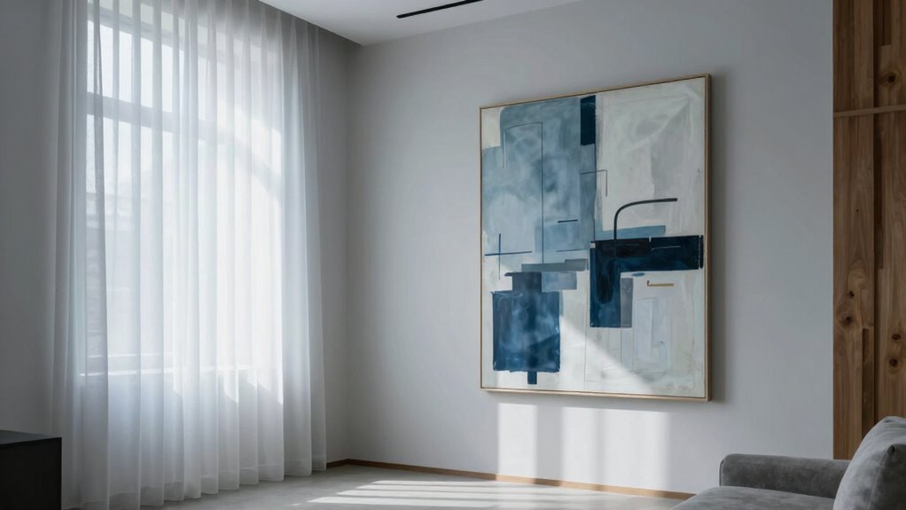

You might notice some art feels too cold or uninviting because it uses cool colors like blues and greens, which evoke calm but can also create emotional distance. These hues can make a space seem sterile or detached, and their placement and composition amplify this effect. Lighting and context play a role, too, shaping how you perceive warmth or chilliness. If you want to understand how to make art feel warmer and more welcoming, keep exploring these subtle cues.

Get furniture and decor delivered free — and shop member deals
- Fast, free delivery on millions of items
- Access to Prime Big Deal Days deals on October 6–7
- Prime Video, Amazon Music and more included
Key Takeaways
- Cool colors like blues and greens evoke calm but can create a sense of emotional distance and coldness.
- Artwork dominated by cool tones can make a space feel sterile or uninviting.
- Minimalist or stark compositions with cool hues enhance feelings of detachment and coldness.
- Lighting and placement influence how colors are perceived, affecting the room’s perceived warmth.
- Using warm colors and thoughtful composition can counteract the cold feeling of certain artwork.
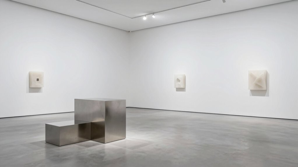
Have you ever stepped into a room and felt an inexplicable chill whenever certain artworks are displayed? That icy feeling isn’t just in your head; it’s often rooted in how the art interacts with your subconscious. Color psychology plays a significant role here, influencing your emotional impact in ways you might not consciously realize. Cool colors like blues, greens, and grays tend to evoke feelings of calm, but they can also create a sense of distance or even coldness—especially when used prominently in art. When you see a painting dominated by these hues, your brain might interpret it as emotionally distant or unapproachable, which can translate into that physical sensation of coldness in the room.
Cool colors in art can create emotional distance, making rooms feel colder and more uninviting.
The emotional impact of certain artwork is powerful. Art that uses cooler tones can make a space feel more sterile or uninviting, even if the intention was to evoke tranquility or serenity. When you’re in a room filled with art that emphasizes these colors, your mind perceives a certain emotional tone—one that’s often associated with calmness, but also with detachment. That detachment can feel like a chill, as if the room itself is emotionally cold. It’s not just about the colors on the canvas; it’s about how those colors influence your perception and feelings. Your brain reacts to the emotional cues embedded in the artwork, and that reaction can manifest physically, making the room feel colder than it actually is. Additionally, the placement of artwork can influence this effect, as it either enhances or diminishes the emotional response.
Furthermore, the lighting in which art is displayed can also intensify or soften these effects, impacting how the colors are perceived and how the emotional response is triggered. Moreover, the way the artwork is composed and the context it’s placed in can heighten this effect. Minimalist or starkly composed pieces tend to amplify feelings of distance, especially if they lean heavily on cool tones. When you’re surrounded by such artwork, your emotional response might be to withdraw slightly, which further enhances that sense of coldness. It’s a subtle but powerful interaction—your mind’s perception of the emotional impact of the art affects your physical experience of the space. This is why some art feels too cold for a room; it’s not just about aesthetics but about how the colors and compositions align with your subconscious cues. Additionally, understanding how color psychology influences emotional responses can guide you in selecting artwork that creates a warm, inviting atmosphere instead of an emotionally distant one.
Frequently Asked Questions
How Can I Warm up a Cold-Looking Art Piece?
To warm up a cold-looking art piece, you can enhance its artistic texture by adding soft lighting or warm tones to the surrounding space. Incorporate elements of cultural context, like complementary decor or colors that reflect its origin, to create a sense of connection and warmth. These adjustments invite viewers to engage more emotionally, making the artwork feel less distant and more inviting in the room.
Do Lighting Choices Affect the Perception of Artwork’s Warmth?
Yes, lighting choices substantially influence how you perceive an artwork’s warmth. Using warm ambient lighting, like soft yellow or amber tones, enhances color psychology, making cool or neutral pieces feel cozier. Conversely, cooler lighting can emphasize a cold atmosphere. You should experiment with different lighting options to see how they impact the artwork’s mood, ensuring it complements the room’s overall ambiance and your desired emotional response.
Can Room Temperature Influence How Art Feels Emotionally?
Yes, room temperature can influence how art feels emotionally. When a space is too cold, it can diminish emotional resonance, making artworks seem distant or uninviting, which may clash with the artist’s intention to evoke warmth or intimacy. Conversely, a comfortable temperature helps viewers connect more deeply with the piece, aligning their emotional response with the artist’s intended message, enhancing overall perception and experience.
Are Certain Colors Inherently Perceived as Colder?
Ever wondered if certain colors are inherently colder? According to color psychology and cultural associations, blues and greens often evoke cooler feelings, but it’s not just about the hue. Your perception is influenced by personal experiences and cultural context. So, while some colors tend to feel colder emotionally, it’s your environment and mindset that truly shape how you experience art’s temperature.
How Does the Art’s Framing Impact Its Perceived Temperature?
Your art’s framing impacts its perceived temperature through frame texture and color contrast. A smooth, sleek frame can make artwork feel colder, while a textured, warm-toned frame adds warmth. High color contrast between the frame and art can also influence perception; strong contrasts often evoke a colder feeling, whereas subtle contrasts create a cozy, inviting atmosphere. So, choose your frame carefully to match the mood you want to evoke.

Scotch Felt Pads 162 PCS Beige, Felt Furniture Pads for Protecting Hardwood Floors, Round, Assorted Sizes Value Pack, Self-Stick design, Protecting from nicks, dents and scratches (SP845-NA)
- Suitable for Various Furniture: Protects chair legs, tables, and more
- Easy to Install: Self-adhesive for quick application
- Protects Multiple Surfaces: Safeguards hardwood, tile, laminate, vinyl
As an affiliate, we earn on qualifying purchases.
Conclusion
So, when you choose art that’s chilly or sterile, you invite an icy atmosphere that distances rather than draws you in. To transform your space, seek soulful strokes and warm hues that whisper welcome. Let your walls whisper stories, wrapping your room in warmth and wonder. Remember, the power lies in pairing passion with purpose, painting personality into every corner. Create a cozy cosmos where art animates, awakens, and truly feels like home.
Evergreen bestsellers Picks
bestsellers
As an affiliate, we earn on qualifying purchases.