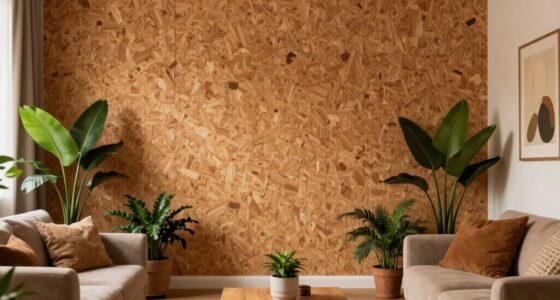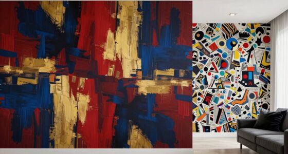
Small repeats look busy faster because they pack pattern elements closely together, creating a dense visual field that captures your attention more quickly. The tight spacing and higher contrast make the pattern seem more active and energetic, drawing your eye repeatedly across the surface. Larger repeats spread out the elements, making the pattern calmer and less immediate. If you want to understand how to balance pattern density to achieve the desired look, keep exploring these design principles.

Get furniture and decor delivered free with Prime
- Fast, free delivery on millions of items
- Prime Video, Amazon Music and more included
- Member-only deals all year
Key Takeaways
- Small repeats pack pattern elements more closely, increasing perceived density quickly.
- Smaller pattern units create a denser visual field, making the pattern appear busier sooner.
- Higher visual density from small repeats amplifies the impression of activity.
- Larger repeats spread elements out, reducing overall visual density and busyness.
- Close proximity of details in small repeats enhances the perception of visual complexity rapidly.

When it comes to repeating patterns, smaller repeats tend to look busier much sooner than larger ones. This is because the eye perceives a higher level of visual density when pattern elements are close together. The closer the details are, the more active the overall appearance feels. If you’re designing fabric, wallpaper, or any pattern-based surface, understanding this principle helps you control how busy your design appears. Small repeats naturally generate a dense visual field, which can overwhelm if not balanced carefully. It’s essential to consider the interplay of color contrast and spacing here—these factors influence how busy or calm the pattern seems.
Small repeats create a denser, busier look—balance color contrast and spacing to achieve the desired visual harmony.
Color contrast plays a crucial role in how the repeating pattern is perceived. When you use high contrast colors—such as black and white or vivid complementary shades—the pattern’s elements jump out more distinctly. This amplifies the visual density, causing the pattern to appear even busier, especially when repeats are small. Conversely, if you opt for low contrast colors or analogous hues, the pattern becomes softer and less overwhelming. This subtle difference can make a small repeat look more harmonious rather than chaotic, giving you more control over the pattern’s overall visual impact.
Visual density, on the other hand, relates to how tightly packed the pattern elements are within a given space. When repeats are small, the elements are packed more closely, creating a denser pattern. Your eye quickly picks up on this density, and because the elements are so close, it feels like there’s more happening at once. Larger repeats, by contrast, spread out the same elements, reducing visual density and making the pattern appear calmer or more spacious. If you want a pattern that feels lively and energetic, small repeats with high contrast can achieve that effect. If you prefer a more subdued, elegant look, larger repeats with softer color contrasts work better.
In essence, the key is balancing size, color contrast, and spacing to manage visual density. Small repeats can overwhelm if your color choices are too stark or if the pattern is too tightly packed. But by tweaking these elements, you can control the perceived busyness. Recognizing that smaller repeats inherently look busier faster helps you make smarter design decisions, whether you aim for vibrancy or serenity. So, pay attention to how your pattern’s elements interact—adjust the color contrast and spacing to craft the visual impact you want, rather than letting the pattern do all the work on its own. Additionally, understanding visual perception can help you optimize your designs for the desired aesthetic and viewer engagement. Being aware of perceived density can also guide your choices in creating patterns that are visually balanced and pleasing. Furthermore, considering how repetition size influences overall pattern impact allows for more intentional design choices that align with your aesthetic goals.
small repeating pattern wallpaper
As an affiliate, we earn on qualifying purchases.
As an affiliate, we earn on qualifying purchases.
Frequently Asked Questions
How Does Human Perception Influence the Busy Appearance of Small Repeats?
Your perception makes small repeats seem busier because your visual processing quickly becomes overwhelmed, leading to perceptual fatigue. When patterns are tiny, your brain constantly works to distinguish details, which increases effort and makes the pattern appear more cluttered. Larger repeats are easier for your eyes to process, so they don’t trigger the same perceptual fatigue, making them look less busy despite their size.
Do Color Variations Affect the Perceived Busyness of Small Versus Large Repeats?
You’ll find that color contrast markedly influences perceived busyness, especially in small repeats—more contrast makes them appear busier faster. Large repeats are less affected because their size offers visual rest. Pattern symmetry also plays a role; symmetrical patterns tend to seem calmer, while asymmetry heightens busyness. Together, these factors make small repeats with sharp color contrasts and asymmetry look the busiest, catching your eye quickly.
Can Pattern Complexity Impact How Quickly Repeats Look Busy?
Yes, pattern complexity considerably impacts how quickly repeats look busy. When a pattern has high visual rhythm and dense pattern elements, it draws your eye more frequently, making the fabric seem busier faster. Small repeats with intricate details create a sense of constant movement, increasing perceived busyness. Conversely, simpler, larger repeats offer more visual space, allowing your eyes to rest, so they don’t appear as busy as quickly.
How Do Lighting Conditions Influence the Perception of Repeats?
Lighting conditions greatly influence how you perceive repeats, creating optical illusions that can make patterns seem busier or calmer. Bright, harsh lighting amplifies visual fatigue, causing small repeats to appear more chaotic and overwhelming quickly. Softer, evenly distributed light reduces strain, helping your eyes process large repeats more comfortably. By understanding this, you can manipulate lighting to manage pattern perception, making repeats feel less busy or more balanced depending on your visual needs.
Are There Cultural Differences in Perceiving Busy Patterns?
Think of patterns as cultural stories woven into fabric; your perception varies with your background. You might see a busy pattern as lively and vibrant or chaotic and overwhelming, depending on your cultural interpretation and aesthetic preferences. Different cultures value symmetry, complexity, or minimalism uniquely, influencing how quickly a pattern feels busy. So, what seems intricate and bustling to one person might be harmonious and balanced to another.
As an affiliate, we earn on qualifying purchases.
Conclusion
So, next time you pick a tiny pattern, remember it’s like inviting chaos into your design. Small repeats explode with busyness faster than you can blink, making your space feel overwhelmed in seconds. It’s as if tiny patterns have a secret weapon—an unstoppable urge to shout for attention. Choose wisely, or risk your room turning into a visual whirlwind that leaves everyone dizzy. Small repeats aren’t just busy—they’re a full-blown design revolution!
As an affiliate, we earn on qualifying purchases.
As an affiliate, we earn on qualifying purchases.
Halloween Picks
halloween
As an affiliate, we earn on qualifying purchases.