
TL;DR

Get furniture and decor delivered free with Prime
- Fast, free delivery on millions of items
- Prime Video, Amazon Music and more included
- Member-only deals all year
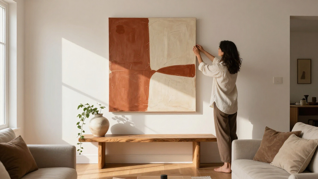
Modern wall art for your living room should span about 2/3 to 3/4 of your sofa’s width, hang with its center at 57–60 inches from the floor, and sit 6–12 inches above the furniture. Too-small art is the #1 mistake designers cite, and one oversized 40-inch-plus statement piece often outperforms a busy gallery wall. Styles range from $20 mass-market prints to $5,000+ originals, with sculptural 3D pieces, curved organic shapes, and earthy palettes dominating 2025 trends.
Your living room might have a great sofa, a beautiful rug, and lighting you love — and still feel like something’s missing. That something is usually the walls. Blank walls make a finished room feel like a showroom nobody moved into yet.
Here’s the good news: choosing modern wall art for a living room is mostly math, not taste. There are exact measurements for size, height, and spacing that designers use on every project. Nail those, and even a $40 print looks intentional. Ignore them, and a $2,000 original can look wrong.
In this article, you’ll get the sizing formulas, the styles that actually count as “modern,” what’s trending in 2025, and a budget breakdown from $20 prints to original works. Let’s fix those walls.
Size art to 2/3–3/4 of your sofa’s width; for an 84-inch sofa, that means a 56–63 inch piece or grouping.
Hang art with its center at 57–60 inches from the floor, or 6–12 inches above furniture — whichever applies.
Match art to your accent colors (the 10% in the 60-30-10 rule), not to the wall or sofa color.
Too-small art is the #1 designer-cited mistake; when choosing between sizes, go bigger.
Spend on size and framing over brand names — a $60 printable download in a large quality frame beats a small premium print.
What Qualifies as Modern Wall Art (and What Doesn’t)
Modern wall art is any piece built around abstraction, simplicity, or clean geometry rather than traditional realism — think abstract compositions, minimalist line art, geometric patterns and grid prints, black-and-white photography, and contemporary typography. What it isn’t: ornate framed landscapes, vintage oil portraits in gilded frames, or anything that leans traditional or classical.
The category is wider than most people realize. It includes metal wall sculptures and dimensional pieces, macro photography (a close-up of a single leaf counts), textile art like modern macramé, and even sculptural mirrors. A plaster relief or a brushed-aluminum abstract panel is just as “modern” as a canvas print — sometimes more so.
Here’s a scenario: your friend has a beige sofa, walnut side table, and a framed black-and-white photo of sand dunes above the couch. That’s modern. Your grandmother’s floral still life in a carved gold frame? Not modern — though interestingly, pairing that antique frame with a contemporary print inside it is a legitimate 2025 trend.
One more distinction that trips people up: modern (early-to-mid 20th century design language) versus contemporary (what’s being made now). In everyday decorating, people use them interchangeably. Don’t stress about it — but if you’re shopping, know that “mid-century modern art” usually means specific retro styles, while “contemporary” covers everything current.
The Sizing Formula: Get These 4 Numbers Right
Your wall art should span roughly 2/3 to 3/4 of your sofa’s width, hang with its center at 57–60 inches from the floor, and leave 6–12 inches between the bottom of the art and the top of the furniture. These three numbers do 80% of the work in making art look “right” in a living room.
Too-small art is the single most common mistake designers cite. A 16×20 print floating alone above an 84-inch sofa looks like a postage stamp on a billboard. Flip it around, though: one large 40-inch-plus piece above that same sofa looks gallery-level.
Follow this sequence and you’ll get placement right the first time:
- Measure your sofa. For an 84-inch sofa, aim for art that’s 56–63 inches wide (a single piece or a grouped arrangement treated as one unit).
- Find center. Mark a point 57–60 inches from the floor — that’s where the center of the art goes, not the top. (Museums use the 57-inch standard, called “gallery height.”)
- Adjust for furniture. If art sits above a sofa or console, ignore strict eye level and keep the gap at 6–12 inches instead. The art should relate to the furniture below it, not float away.
- Space gallery pieces tightly. If you’re grouping frames, keep 2–3 inches between them. Wide gaps break the arrangement into visual confetti.
Renter tip: if you can’t (or don’t want to) drill, oversized art leaned against the wall on a console or mantel is a full-on trend right now — no holes, full impact. Command strips and tension-rod systems handle lighter frames too.
Should Art Match the Couch or the Wall? (Neither, Mostly)
Modern wall art should echo your room’s accent colors, not match the sofa or wall color exactly. Matching the wall makes art disappear; matching the sofa makes the room look like a furniture-store display. You want the art to pick up a secondary color from your rug, pillows, or a throw — pulling the room together without blending in.
A quick example: cream walls, a greige sofa, and a burnt-orange pillow. Art with terracotta and cream tones ties directly to that pillow, and suddenly the room feels curated instead of assembled.
Two palettes dominate living rooms right now, and they pull in opposite directions:
| Approach | Colors | Best Art Pairing |
|---|---|---|
| Warm minimalism | Beige, cream, olive, terracotta, gray | Line art, botanical modernism, earthy abstracts, textured pieces |
| Color drenching | Saturated jewel tones — emerald, sapphire, oxblood | Black-and-white photography, high-contrast art, metallics |
Notice why these pairings work the way they do: warm minimalism is already quiet, so art with texture and organic movement adds depth without shouting. A color-drenched room, on the other hand, is already loud — so the art’s job flips from adding interest to providing contrast and a visual resting point. That’s why black-and-white photography performs so well on emerald walls: it gives your eye somewhere to land. The tradeoff to weigh: in a drenched room the art recedes into the overall effect, while in a minimal room the art becomes the focal point. If you want your art noticed, choose the quiet palette; if you want the room itself to be the statement, drench.
If you want a formula, use the 60-30-10 rule: 60% dominant color (walls, sofa), 30% secondary (rug, curtains), 10% accent. Your art lives in that 10% — it’s the exclamation point, not the sentence.
One Big Statement Piece or a Gallery Wall?
One large statement piece (40 inches or wider) works best over a sofa, behind a TV, or in any room where you want calm; a gallery wall works best on long empty walls, stairways, or when you genuinely have many pieces you love. The current trend strongly favors the oversized single piece — but the gallery wall hasn’t died, it’s just evolved.
That evolution matters. The old symmetrical grid of identical frames in identical mats now reads a little corporate. What’s replaced it is salon-style eclecticism: mixed frame styles, mixed sizes, antique frames next to thin modern ones, a small textile piece thrown in. The trick that keeps it from looking cluttered is simple — consistent 2–3 inch spacing and one shared element (color palette, frame finish, or subject matter) running through everything.
- Go single statement piece if your living room is small, busy, or has a TV competing for wall space.
- Go gallery wall if you have a long bare wall, a mix of pieces you actually love, and a room that can handle visual activity.
- Go multi-panel (triptych) as a middle path — one image split across three panels reads as both large-scale and dynamic.
Real-world check: a small living room with a 72-inch sofa, a TV on the adjacent wall, and a coffee table already covered in books? One large abstract above the sofa, nothing else. Every additional frame would just compete.
What’s Trending in 2025 (and What’s Fading)
The biggest 2025 trend in modern wall art for living room spaces is dimensionality — sculptural plaster reliefs, wood slat art, and 3D pieces that cast real shadows as daylight moves across them. Flat prints aren’t gone, but texture is winning, and the reason is worth understanding: as screens dominate more of our visual lives, rooms full of flat, printed surfaces have started to feel like extensions of the screen. Dimensional art pushes back against that — it changes hourly with the light, which makes a room feel alive rather than styled. The tradeoff is real, though: 3D pieces cost more, weigh more, and are far harder to hang than a framed print, and they can read busy in an already-textured room (think rattan furniture plus a shag rug plus a plaster relief — that’s three textures too many).
Here’s what’s shaping living rooms right now, and why each one is working:
- Curved and organic shapes — arch mirrors, blob-shaped frames, anything echoing the “soft minimalism” movement. This is a direct correction to a decade of hard-edged, boxy minimalism; curves make stark rooms feel habitable.
- Earthy palettes — terracotta, olive, and cream dominating over cool grays. Gray had a ten-year run; the shift toward warmth reflects a broader move toward rooms that feel calming rather than sleek, and it’s also practical — earth tones hide wear better than bright whites.
- Vintage revival — 70s-inspired prints and risograph art, plus antique frames holding contemporary pieces. Mixing eras signals intention: it says you chose things over time rather than bought a look in one afternoon.
- Statement murals and decals — the wall treatment itself becomes the art. Maximum impact for minimal cost, but the lowest reversibility: this is the one trend renters and commitment-phobes should approach carefully.
- Oversized leaning art — huge pieces propped on mantels and consoles instead of hung. It reads relaxed and confident, and doubles as the practical answer to rental walls — but it eats floor space and needs a stable footing, so it suits larger rooms more than small ones.
- Sustainability — reclaimed wood art and eco-friendly print materials. Increasingly a genuine purchasing criterion rather than a marketing footnote, especially at the mid-price tier where buyers can compare materials.
- Personalization — custom portraits and travel photography treated as gallery pieces, not phone dumps. The trend isn’t “hang your photos” so much as “curate them like a gallery would” — one large framed piece, not a collage grid.
And yes, you can absolutely mix 3D art with flat prints. A plaster relief flanked by two framed black-and-white photos is a designer move, not a clash — the key is keeping the palette unified, because when color stays consistent, the difference in dimension reads as depth rather than discord.
One quiet upgrade most people skip: lighting. A simple picture light or a track head aimed at your art at a 30-degree angle transforms how it reads, especially in the evening. The implication matters for buying decisions: art that only looks good in daylight is only doing half its job, since most living rooms get used most after dark. Lighting is what makes the difference between art that exists and art that performs — often for under $50.
What Modern Wall Art Actually Costs (Every Budget Tier)
You can put legitimate modern wall art on your living room wall for $20 or for $5,000 — and the gap between “cheap-looking” and “intentional” has far more to do with size and framing than price. That’s because at living-room viewing distance, the first thing your eye registers is scale and proportion, not provenance. Nobody standing across the room can tell a gallery original from a good giclée; everybody can tell a 16-inch frame from a 48-inch one. Here’s the honest breakdown:
| Tier | Price Range | Where |
|---|---|---|
| Mass-market prints | $20–$80 | IKEA, Target, Amazon |
| Printable downloads + your own frame | $5–$30 per file | Etsy digital shops; print at a local shop |
| Independent artists & platforms | $50–$400 | Etsy, Society6, Displate, Minted |
| Emerging-artist originals | $300–$2,000 | Saatchi Art, local galleries, open studios |
| Established originals | $2,000–$5,000+ | Galleries, art fairs |
What each tier actually buys you — and where the diminishing returns kick in: the jump from mass-market to independent-artist platforms ($50–$400) gets you originality; your walls won’t match a million others, and the quality of printing and materials improves noticeably. The jump from independent prints to emerging-artist originals ($300–$2,000) buys you something different: uniqueness and story. A one-of-one piece can’t be re-bought, may appreciate, and changes how you relate to the room — people form attachments to originals they never form to prints. But understand the tradeoff: originals are riskier. You’re betting on your own taste without the filter of a mass platform, and framing costs run higher because odd sizes need custom work. Above $2,000, you’re mostly paying for the artist’s reputation and investment potential — which matters if you’re collecting, and doesn’t at all if you’re decorating.
The sleeper value pick is the printable download. You buy a digital file for ten dollars, print it large at a local print shop for twenty, and drop it in a frame — a 24×36 statement piece for under $60 that nobody will guess came from a PDF. The reason it works isn’t just price: it’s the only tier where you control the final size, which — per the sizing formula above — is the variable that matters most.
Spend your money where it shows: a large size and a good frame beat a famous name every time. A thin black frame on a well-sized print reads expensive; a tiny premium print in a flimsy frame reads like a dorm. A useful budget split for a $200 total: $30 for the art file or print, $170 for size and framing. It sounds backwards until you see it on the wall.
3 Mistakes That Make Good Art Look Bad
The three mistakes that ruin modern wall art most often are hanging it too high, choosing pieces too small, and skipping the lighting. All three are free or nearly free to fix — which makes them especially painful when they’re the reason a room feels off.
Mistake 1: Hanging too high. People instinctively hang art near the ceiling line, leaving a dead gap between art and sofa. Center at 57–60 inches, or 6–12 inches above the furniture. When in doubt, go lower — nobody ever regretted art that “talks to” the sofa.
Mistake 2: Playing it safe with size. Remember the 2/3-to-3/4 rule? Most people buy half of what the wall needs. If you’re torn between two sizes, buy the bigger one.
Mistake 3: Hanging heavy art with a single nail. A large framed piece on regular drywall needs a stud or proper anchors — a single nail in plain drywall is how living rooms meet insurance claims. Use a stud finder, or rated toggle anchors for heavier pieces, and check the weight rating before you hang.
If a piece is heavy, oversized, or you’re mounting into anything other than standard drywall — tile, brick, plaster — have it professionally hung. It usually costs less than repairing both the art and the wall.
Frequently Asked Questions
How big should wall art be over a couch?
Aim for art that spans 2/3 to 3/4 of the sofa’s width. For a standard 84-inch sofa, that’s a piece (or grouped arrangement) 56–63 inches wide. Too-small art is the most common mistake designers see, so when in doubt, size up.
How high should I hang wall art in the living room?
Hang art so its center sits 57–60 inches from the floor — the museum standard called gallery height. If the art goes above a sofa or console, prioritize a 6–12 inch gap between the furniture and the bottom of the frame instead of strict eye level.
Should wall art match the couch or the wall color?
Neither. Match art to your accent colors — the pillows, throws, or rug details that make up roughly 10% of the room under the 60-30-10 rule. Matching the wall makes art vanish; matching the sofa makes the room look staged.
Where can I find affordable modern wall art that doesn’t look cheap?
Etsy, Society6, Displate, and Minted offer independent-artist pieces from $50–$400, while printable downloads ($5–$30) let you print large locally and frame yourself. The secret to looking expensive is size and a quality thin frame — a large $60 printable beats a small premium print every time.
One large piece or a gallery wall?
Choose one large statement piece (40 inches or wider) over a sofa or near a TV; choose a gallery wall for long empty walls or stairways. If you go gallery-style, keep 2–3 inches between frames and repeat one element — palette, frame finish, or subject — so the arrangement reads curated, not cluttered.
Conclusion
Here’s the one thing to remember: modern wall art succeeds on placement before it succeeds on taste. Get the width to 2/3 of your sofa, the center to 57 inches, the gap to under a foot — and whatever you hang will look like you hired someone.
So measure your sofa tonight. Before you buy a single print, put painter’s tape on the wall at the size you’re considering. Stand back. That five-minute tape outline will tell you more than a hundred hours of scrolling ever will.
Fall Picks
fall essentials
As an affiliate, we earn on qualifying purchases.