
TL;DR

Get furniture and decor delivered free — and shop member deals
- Fast, free delivery on millions of items
- Access to Prime Big Deal Days deals on October 6–7
- Prime Video, Amazon Music and more included
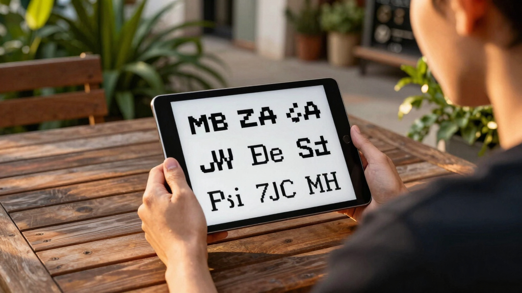
Recent pixel font designs blend nostalgia with functionality. Notable examples include Analog Mono, Coral Pixels, Two Slice, and Geist Pixel, each addressing traditional limitations and modern needs.
Several modern pixel fonts have been introduced, combining nostalgic design elements with practical improvements for digital usage, notably Analog Mono, Coral Pixels, Two Slice, and Geist Pixel.
Andrew Gleeson designed Analog Mono to correct issues found in classic 1990s pixel fonts, such as low baseline problems that caused descenders to be pulled up. Coral Pixels, created by Kumiko Yoshida for Google Fonts, introduces colorful fringing inspired by subpixel rendering artifacts, aiming to evoke nostalgia or serve as a visual element. Joseph Fatula’s Two Slice is a minimalistic font only 2 pixels tall, offering a somewhat readable option for ultra-low-resolution contexts.
Meanwhile, Geist Pixel from Vercel is positioned not as a novelty but as a system extension designed for real-world use. It addresses common issues with pixel fonts in production, such as poor scalability and conflicting metrics, by maintaining visual texture while ensuring typographic rigor. The font emphasizes the importance of surrounding metadata, kerning, and glyph metrics, making it suitable for practical application rather than mere decoration.
Why It Matters
This development matters because it signals a shift towards functional pixel typography that can be reliably used in digital products. As pixel fonts often face issues in scaling and integration, these new designs aim to bridge nostalgia with modern typographic standards, potentially influencing how digital interfaces and branding incorporate pixel aesthetics.
As an affiliate, we earn on qualifying purchases.
Background
Pixel fonts gained popularity in the 1990s on devices like VCRs and TVs, often characterized by low resolution and specific design constraints. Over time, their practical use declined due to poor scalability and integration issues. Recent efforts, such as Analog Mono and Geist Pixel, reflect a renewed focus on creating pixel fonts that are both visually appealing and technically robust, addressing long-standing limitations.
“Analog Mono fixes the crimes of VCR OSD Mono, especially the low baseline issue that pulled up descenders.”
— Andrew Gleeson
“Coral Pixels introduces colorful fringing inspired by subpixel rendering, evoking nostalgia or serving as a visual element.”
— Kumiko Yoshida
“Two Slice is a 2-pixel-tall font that’s somewhat readable, suitable for ultra-low-res contexts.”
— Joseph Fatula
“Geist Pixel isn’t a novelty font but a system extension designed for real usage, maintaining visual texture and typographic rigor.”
— Vercel team
monospaced pixel font for programming
As an affiliate, we earn on qualifying purchases.
As an affiliate, we earn on qualifying purchases.
What Remains Unclear
It remains unclear how widely adopted these fonts will become in production environments or whether similar innovations will emerge from other designers. The long-term impact on digital typography standards is still developing.
low-resolution pixel font for retro gaming
As an affiliate, we earn on qualifying purchases.
As an affiliate, we earn on qualifying purchases.
What’s Next
Next steps include broader testing of these fonts in real-world applications, integration into design tools, and potential adoption by digital products seeking pixel aesthetic options with reliable performance.
As an affiliate, we earn on qualifying purchases.
Key Questions
What makes these modern pixel fonts different from older ones?
They address practical issues like scalability, metrics, and metadata, making them more suitable for digital use while maintaining nostalgic aesthetics.
Are these fonts available for public use?
Some, like Coral Pixels, are available via Google Fonts, while others are prototypes or design concepts that may or may not be publicly released.
Can these fonts be used in professional digital projects?
Yes, especially Geist Pixel, which is explicitly designed for production environments, offering a balance of visual texture and typographic precision.
Why is there renewed interest in pixel fonts now?
Designers aim to blend nostalgia with modern functionality, leveraging pixel fonts for branding, UI, and creative projects that benefit from retro aesthetics combined with technical reliability.
Source: Hacker News
Halloween Picks
halloween
As an affiliate, we earn on qualifying purchases.